Vertical Organizational Chart
Illustrate hierarchies top-down with the vertical org chart template. Promote clear communication and avoid misunderstandings inside your organization.
About the Vertical Org Chart Template
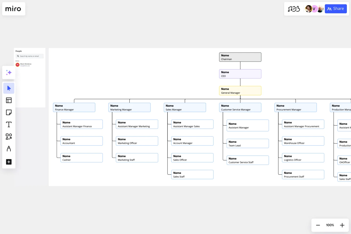
A well-defined organizational structure is crucial for effective communication and a clear understanding of roles and responsibilities within an entity. The Vertical Org Chart Template is a valuable tool that enables teams to visualize the hierarchical relationships and team dynamics in a top-down manner.
This template provides a structured representation of people and their roles within an organization, with the highest authority at the top and the hierarchy branching downwards. Each section of the template represents a tier of the hierarchy. By mapping out these relationships, one can easily understand the flow of responsibilities and communication channels within an organization.
How to use the vertical org chart template
Add your data: Begin at the topmost tier, representing the highest authority, and work your way down. Fill in each section with the appropriate title or individual's name by double-clicking the shapes.
Customize with ease: Adjust the size, color, and design of each block to match your organization's branding or to differentiate between departments. Use the context-menu bar to edit your vertical org chart features.
Expand as needed: Need to add more tiers or members? Use the automated diagramming features to add additional shapes and connector lines seamlessly.
Give more context: Beyond names and titles, you can attach any artifact to your chart, like photos, documents, or notes, to provide additional context.
Why should you use a vertical org chart template?
Visualizing the hierarchy of an organization can have several benefits, including clear communication, efficient onboarding, strategic planning, transparency, and enhanced collaboration.
Clear communication: By visualizing the hierarchy, organizations can ensure clear communication channels, reducing misunderstandings and potential conflicts.
Efficient onboarding: New members can quickly understand the organization's structure, facilitating faster integration and orientation.
Strategic planning: Decision-makers can use the chart to identify gaps, redundancies, or potential areas for expansion or consolidation.
Transparency: Employees gain clarity on reporting lines and understand their position within the broader organizational context.
Enhanced collaboration: Recognizing interconnected roles can foster collaboration between departments or teams, driving synergies and improved outcomes.
Miro is the perfect org chart creator to help visualize and understand your organization's hierarchical structure and reporting lines between roles. If you're interested in learning more about organizational charts you can read our in-depth guide.
Can the template be customized to fit large organizations?
Absolutely. The template is scalable, allowing for the addition of more tiers and entities. The automated diagramming features ensure that expanding the template remains a smooth process.
Is it possible to link external documents or websites to the chart?
Yes. Artifacts, such as documents or URLs, can be attached to any part of the chart, offering a richer context and acting as a quick reference point.
How can I differentiate between departments or teams in the chart?
The template is highly customizable. You can change colors, shapes, and designs to demarcate different departments or teams, making the visualization more intuitive.
Can the Vertical Org Chart be shared and edited collaboratively?
Indeed. Like other templates, the Vertical Org Chart allows real-time collaboration, enabling teams to jointly input, edit, and finish the organizational structure.
Get started with this template right now.
Bar Chart / Diagram Combined
Works best for:
Diagramming
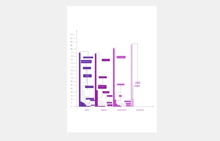
The Bar Chart / Diagram Combined template offers a versatile tool for creating visualizations that combine bar charts with other diagrammatic elements. It provides elements for representing data trends, relationships, and comparisons effectively. This template enables teams to create customized visualizations that communicate complex information in a clear and compelling manner. By promoting visual clarity and insight, the Bar Chart / Diagram Combined template empowers teams to make data-driven decisions and communicate findings with impact.
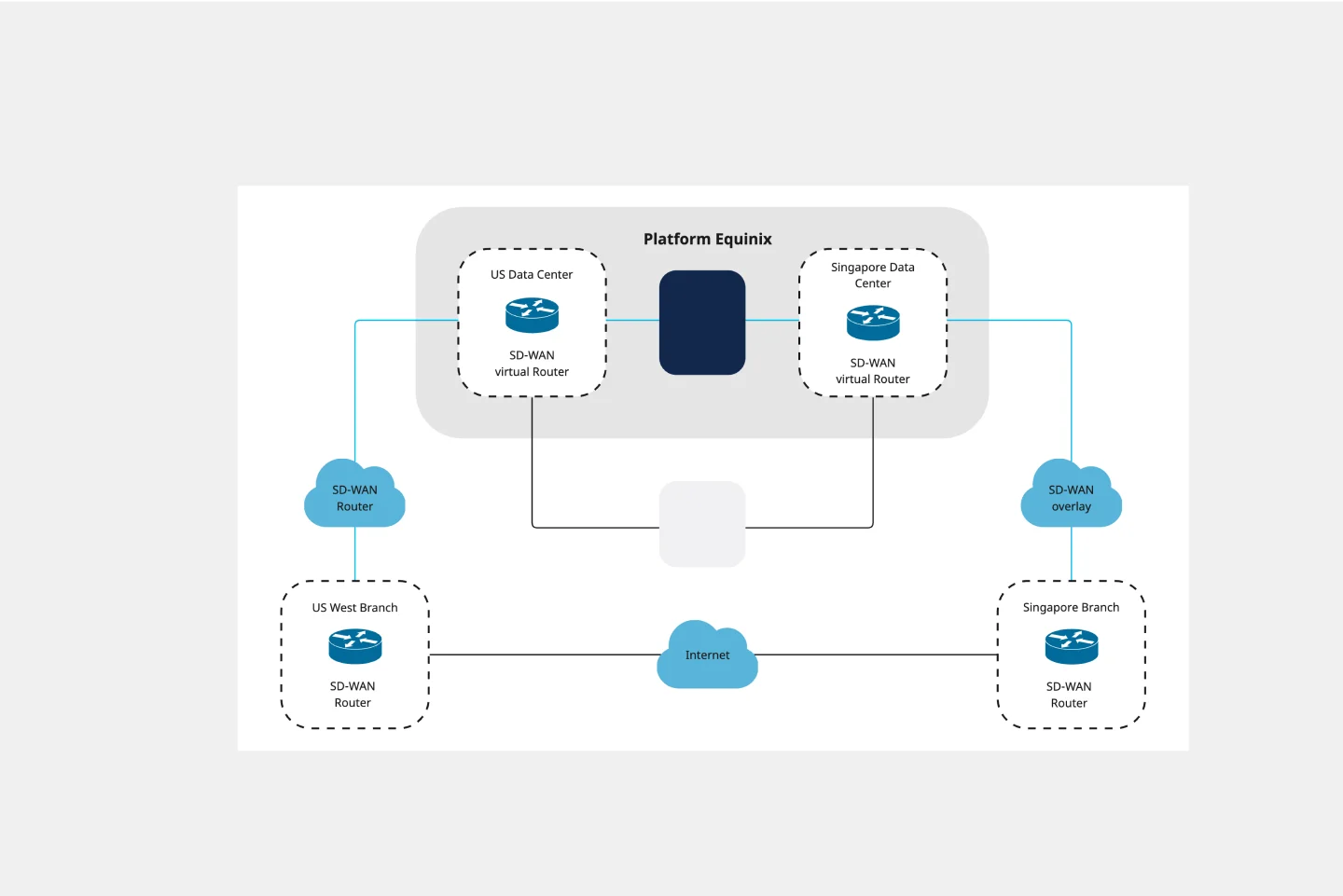
Azure Architecture Diagram Template
Works best for:
Software Development, Diagrams
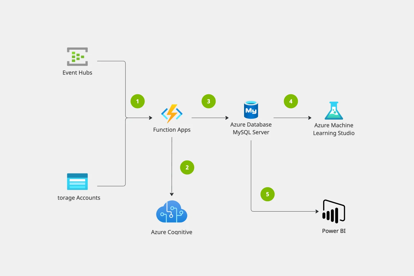
The Azure Architecture Diagram Template is a diagram that will help you visualize the combination of any data and build and deploy custom machine learning models at scale. Azure is Microsoft’s cloud computing platform, designed to provide cloud-based services such as remote storage, database hosting, and centralized account management. Use Azure Architecture Diagram template to build sophisticated, transformational apps.
Team Charter by Daniela Felser
Works best for:
Org Chart
The Team Charter template helps teams establish shared goals, values, and norms. By defining team purpose, roles, and operating principles, this template aligns team members and guides collaboration. With sections for setting objectives and outlining team processes, this template promotes transparency and cohesion, enabling teams to work efficiently towards common objectives.
Cisco Data Network Diagram Template
Works best for:
Software Development
Cisco offers data center and access networking solutions built for scale with industry-leading automation, programmability, and real-time visibility. The Cisco Data Network Diagram uses Cisco elements to show the network design of Cisco Data Networks visually.
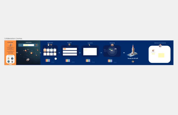
Collaboration Cosmos Team Charter
Works best for:
Org Charts, Operations, Mapping
The Collaboration Cosmos Team Charter template fosters collaboration by defining team goals and values. By visualizing team dynamics and norms, this template aligns team members and promotes mutual understanding. With sections for setting collaboration guidelines and documenting team agreements, this template enhances communication and teamwork, enabling teams to achieve shared objectives effectively.
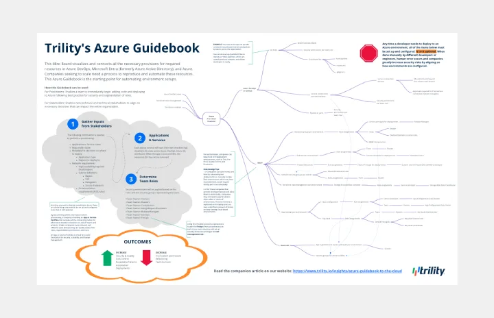
Azure Guidebook
Works best for:
Cloud Infrastructure
This Miro Board visualizes and connects all the necessary provisions for required resources in Azure DevOps, Microsoft Entra (formerly Azure Active Directory), and Azure.