Spaghetti Diagram Template
Get an overview of a process and find areas of improvement
About the Spaghetti Diagram Template
The Spaghetti Diagram Template can help you visualize the flow of people, materials, documentation, and products in your processes, as well as how these elements interact with each other.
Spaghetti diagrams are also part of LEAN tools, a set of problem-solving methods designed to increase process efficiency. These tools are particularly helpful when reengineering business processes.
This template enhances your understanding of a current process, helping you identify redundancies and spot areas for improvement. You can also use the template to map out a workflow before implementing a process change.
For example, you might use this template to map out a patient's experience at a hospital. You'll also want to include the management hierarchy for staff, emergency protocols, and information about the supplies needed in each department.
This way, employees at all levels of the organization can understand how their work processes fit into the hospital's process flow as a whole and identify areas that need improvement.
Keep reading to learn more about the Spaghetti Diagram template.
What is a spaghetti diagram?
A spaghetti diagram, also known as “spaghetti chart,” “spaghetti plot,” or “spaghetti model,” is a visualization tool used in process mapping to show the flow of information, people, and products.
In a spaghetti diagram, each part of the process flow is represented as a strand. These strands come together at decision points or "intersections" to form a network.
A set of tasks are represented by colorful, semi-transparent strands that connect up to show how they're related in time, space, or agreement with one another.
For instance, let's say you are designing a website and want to plan out the basic page flow. You could represent each web page as one of the noodles in the diagram, and then you could show which pages link to one another (dependencies) with connecting noodles.
Or you could show what pages people visit before they purchase a certain product, what steps are involved in the purchasing process (work sequences), and who they're working with (agreements) during the purchasing process.
In short, a spaghetti plot is a quick and easy way to track distances between parts, people, or work that otherwise would be hard to represent.
Benefits of using a Spaghetti Diagram Template
Some of the benefits of spaghetti diagrams include:
Quickly identify process waste and inefficiencies: Since spaghetti diagrams are simple and easy to read, it's easy to identify problems quickly and improve the quality of a process.
Identify non-value added time: Since the spaghetti diagram freezes work-in-progress for a particular time slice, you can see how much time is actually spent doing standard work versus how much time is wasted organizing tasks or attending.
Keep everyone on the same page: This diagram can be helpful when you want to visually track work that needs to be done between different departments or stakeholders and make sure everyone’s on the same page.
Track the working schedule of people and machines: When there are multiple work areas or production lines, a spaghetti diagram can help you track everyone’s and everything’s working schedule.
Maximize productivity: Since spaghetti diagrams (can) provide a quick way to see and understand the big picture, you can make sure everyone is working on things that are most important.
Create your own spaghetti diagram
With Miro, you can create your own spaghetti diagram in minutes. Get started by opening our Spaghetti Diagram Template.
This template comes pre-loaded with sticky notes and connector lines.
Step 1: Start by adding your first noodle or set of tasks. Begin to build the spaghetti diagram by adding other noodles.
Step 2: Drag and drop noodles to connect them to each other, or move noodles by dragging them around on the canvas. The connector lines will adjust automatically to maintain the connection.
Step 3: Add a sticky note by double-clicking on a noodle and typing in the text of your choice. You can also move the note by dragging it around on the canvas.
Step 4: When you're done, simply save your spaghetti diagram and share it with any relevant team members.
With Miro, collaborating with team members is pretty straightforward. You can invite your team to collaborate on a specific template and edit your data in real-time.
Example of a spaghetti diagram in action
Let’s imagine that you’re the owner of a car manufacturing company and want to improve your stamping process. Let’s also imagine that your stamping process has four steps:
Find the type of metal the part should be made from
Punch out the corresponding shapes
Stamp or punch out additional shapes
Clean up the final product
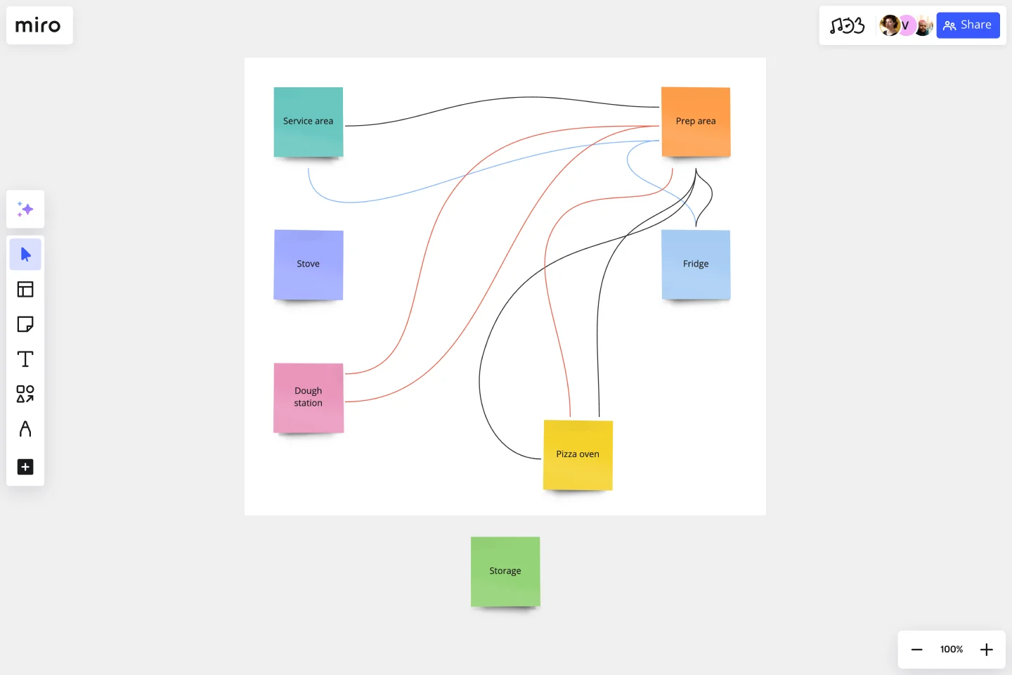
To manage this process, you create a spaghetti diagram with four noodles labeled ‘1’ through ‘4’. You then create four labels on each noodle that say ‘Metal Type,’ ‘Punch Shapes,’ ‘Stamp Shapes,’ and ‘Cleanup.’
You then color code each label with the same color as the noodle it’s on and finish by drawing connection lines between each step.
This allows you to visualize your entire stamping process and understand how the different steps connect.
What is a spaghetti diagram used for?
A spaghetti diagram is usually used to illustrate a process or set of processes. It shows the various stages and interactions between each stage, allowing the reader to visualize how things are connected. This helps you see both the big picture and all of its individual components.
What is a spaghetti diagram in Six Sigma?
In lean manufacturing, a spaghetti model is a form of process mapping that’s used to identify opportunities for improvement. They’re usually used to show how transactions flow through an organization, including the steps involved and the possible choke points.
How do you use spaghetti diagrams?
In our Spaghetti Diagram Template, the stages of a process are shown in a different color. Interactions between stages are marked with arrows (or lines) formatted to show which stage they connect to. The thickness of the arrows is proportional to the frequency of interactions, which allows for easy comparison.
Why use a spaghetti diagram?
Spaghetti diagrams illustrate the big picture of a process, which is useful for identifying areas where you might need more data or optimization. A spaghetti diagram allows you to see the process as a whole, making it easier to identify opportunities for improvement.
Get started with this template right now.
Feature Planning Template
Works best for:
Desk Research, Agile Methodology, Product Management
Features are what make a product or service fun, but adding new ones is no walk in the park. It takes many steps—ideating, designing, refining, building, testing, launching, and promoting—and just as many stakeholders. Feature Planning lets you put a smooth, sturdy process in place, so you can add a feature successfully, and spend less time and resources doing it. That makes our Feature Planning Template a smart starting point for anyone looking to add new product features, especially members of product, engineering, marketing, and sales teams.
System Context Diagram
Works best for:
Diagramming
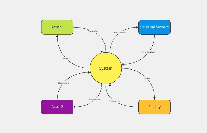
The System Context Diagram template is a visual tool for illustrating the relationships between a system and its external entities. It provides elements for depicting system boundaries, interfaces, and interactions with external stakeholders. This template enables teams to understand the broader context in which a system operates, facilitating requirements analysis and design decision-making. By promoting clarity and alignment, the System Context Diagram empowers teams to design systems that meet stakeholder needs and integrate seamlessly with their environment.
Porter's Five Forces Template
Works best for:
Leadership, Strategic Planning, Market Research
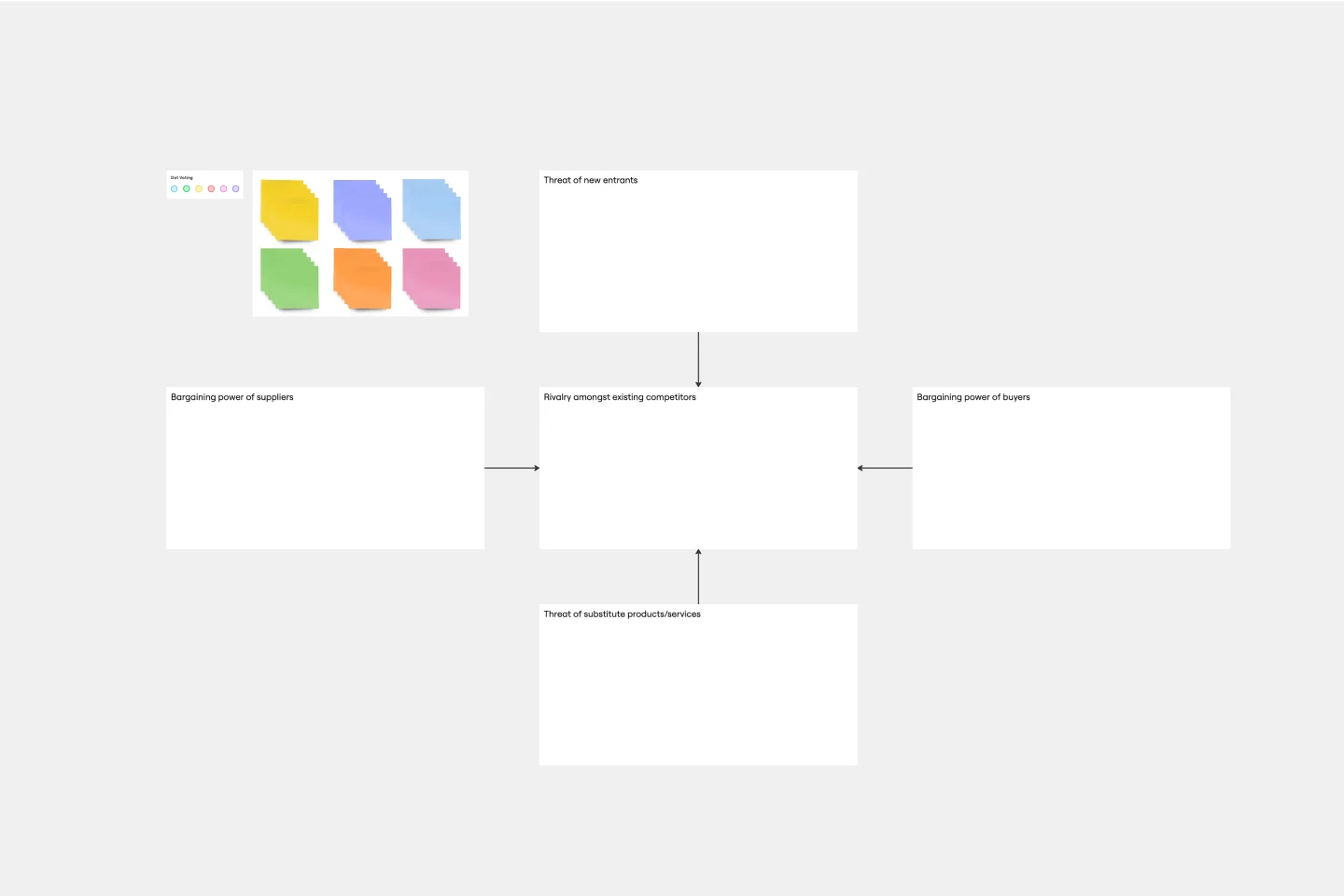
Developed by Harvard Business School professor Michael Porter, Porter’s Five Forces has become one of the most popular and highly regarded business strategy tools available for teams. Use Porter’s Five Forces to measure the strength of your current competition and decide which markets you might be able to move into. Porter’s Five Forces include: supplier power, buyer power, rivalry among existing competitors, the threat of substitute products or services, the threat of substitute products and services, and the threat of new entrants.
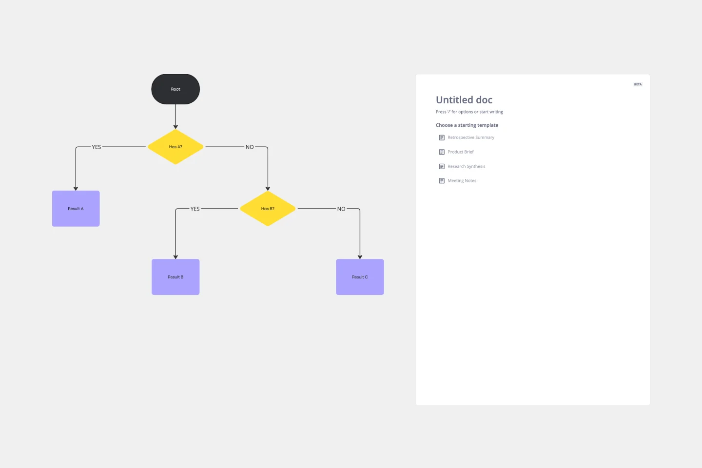
Dichotomous Key Template
Works best for:
Diagramming
The Dichotomous Key Template stands out as an exceptional tool for simplifying complex classification processes, significantly enhancing learning experiences. Breaking down intricate subjects into a series of binary decisions transforms how information is absorbed and understood. This systematic approach not only aids in retaining intricate details but also makes the learning process more engaging and interactive. Whether for educational purposes or professional use, the template’s design fosters a deeper comprehension of the subject matter, allowing learners and professionals to navigate complex scenarios with clarity and ease.
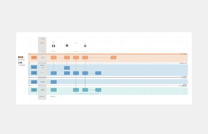
Service Blueprint by Edmond Gozo
Works best for:
Diagramming
The Service Blueprint template is a visual tool for designing and optimizing service experiences. It provides a structured framework for mapping customer journeys, identifying touchpoints, and aligning internal processes. This template enables teams to visualize the entire service ecosystem, uncover pain points, and innovate solutions to enhance customer satisfaction. By promoting customer-centricity and collaboration, the Service Blueprint empowers organizations to deliver exceptional service experiences and drive sustainable growth.
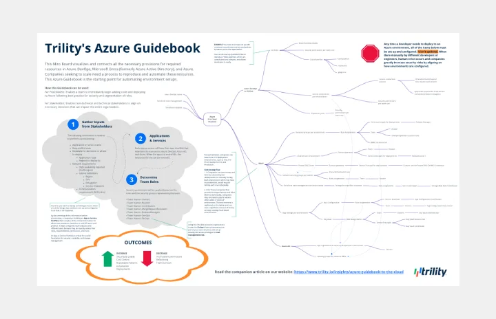
Azure Guidebook
Works best for:
Cloud Infrastructure
This Miro Board visualizes and connects all the necessary provisions for required resources in Azure DevOps, Microsoft Entra (formerly Azure Active Directory), and Azure.