Influence Diagram Template
Build a clear picture of exactly what impacts your business decisions with the influence diagram template.
About the Influence Diagram Template
Making business decisions can be difficult, as it can be hard to understand everything that influences your decisions. An influence diagram helps simplify the decision-making process by allowing you to understand it from a high level.
Keep reading to learn more about our Influence Diagram Template.
What is an Influence Diagram?
An Influence Diagram visualizes the factors impacting a decision at a high level. It defines what you need to decide, the factors that you can and can’t control, and the possible outcomes that you can evaluate to see if they meet your needs.
Influence Diagrams are less complex than some other decision-making visualizations, such as Decision Trees. Where a Decision Tree diagram maps out each possible decision in detail, much like a flowchart, an Influence Diagram lets you think and rethink each factor as often as you need.
Benefits of using an Influence Diagram
Making decisions is hard in any context. An Influence Diagram gives you a high-level picture of key decisions so that you have all the information you need to make the best choice.
Since influence diagrams are a simple visual representation, they’re easy for everyone to understand. The standard notation — more on that later — creates an easy view of the types of factors involved, so employees, executives, and stakeholders alike can understand what’s at play.
The Influence Diagram can be used by a range of business professionals — it’s useful for anyone wanting to improve their decision-making capability.
In a project management context, influence diagrams are important for mitigating risk and predicting uncertainty that could lead to poor project outcomes.
When strategic planning, influence diagrams can help you choose the best course of action for the future of your business.
Create your own Influence Diagram Template
With Miro, you can create an Influence Diagram with just a few easy steps. You’ll be able to refine the influences or reframe your decision as you go. To get started, open up the Influence Diagram Template. Then follow these steps:
Step 1:
Define the decision you have to make as concisely as possible. This could be a yes or no question or a decision that needs a value, such as a budget. Enter your decision in the rectangle in the template.
Step 2:
Make a list of everything that could influence the decision. You can easily create your list in Miro and share your thoughts with others for their input. Some of your factors might depend on each other, or they might vary based on information you don’t yet have.
Step 3:
Assign the right notation to each factor in your Influence Diagram.
Influence diagrams use a standard notation to help you see what kind of decision variable you’re working with. There are four main types of nodes you’ll use:
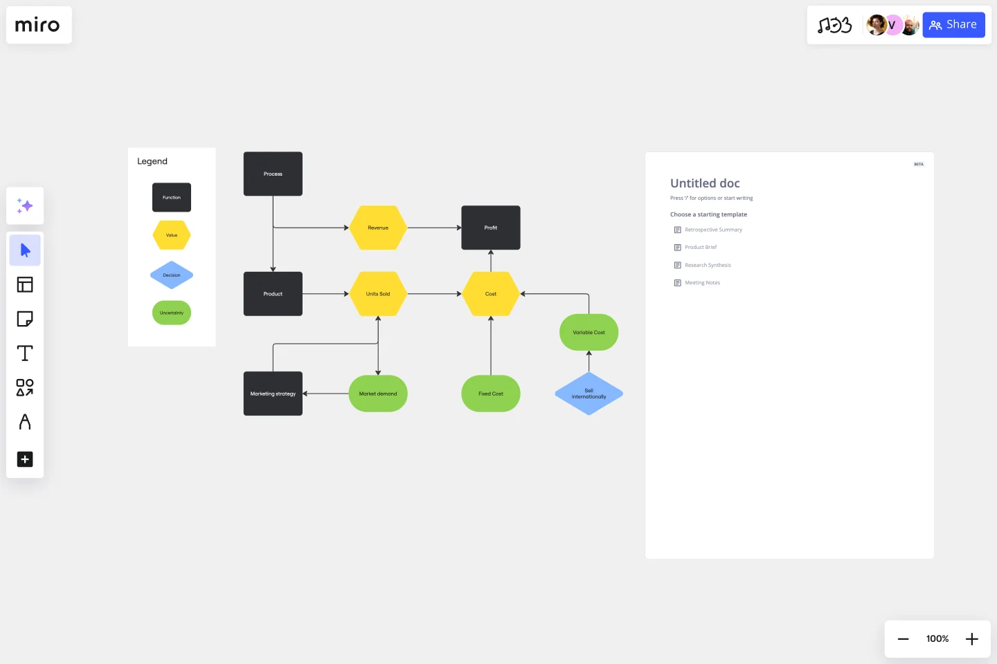
Decision (rectangle): the root question you are trying to answer.
Uncertainty (oval): variables you may not know or be able to control.
Function (rounded rectangle): variables that may be calculated or influenced by factors you can control.
Value (hexagon): the final outcome of the decision, which you can evaluate to determine if it aligns with your business needs.
Step 4:
Draw arrows between nodes to represent paths of influence, dependence, or relevance. What the arrows represent depends on the type of node they point to.
For example, in our pre-filled Influence Diagram Template, the arrow originating from the decision node indicates that the decision to sell internationally depends on the unit variable cost.
In another part of the template, arrows indicate that market demand and the marketing strategy influence the number of units sold.
You don’t have to draw arrows between all of your nodes. In fact, the lack of an arrow can sometimes convey a lot about the path of influence in a decision.
Step 5:
Go back to your original decision node and follow the paths of influence throughout your diagram. You might find that you need to make a few changes.
For instance, you might refine some of your uncertainties or think differently about how these factors relate to each other. An influence diagram is a tool to help you think in real-time, so don’t be afraid to make lots of changes as you think through your decision.
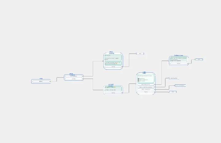
Example of an effective Influence Diagram
Let’s take a look at the simple Influence Diagram example included in our pre-filled template. The rectangle in the bottom right-hand corner represents the decision: should the business sell internationally?
The outcome of this decision will impact the unit variable cost, an uncertainty represented by an oval. We know the direction of impact because of the arrow. In turn, the unit variable cost, once known, will influence the overall cost to the business.
From here, you can follow the nodes and arrows in this influence diagram example to further understand how these variables impact each other, the overall outcomes, and the final decision.
Why is an Influence Diagram important?
Creating an Influence Diagram is a fast and reliable technique for understanding influence and risks in a given scenario. By looking at decisions at a high level, you can build an easy-to-understand visualization of complex and important problems. This way, you and your team can develop a deeper understanding of the decision at hand.
What are the two meanings of an arrow in an Influence Diagram?
In an Influence Diagram, arrows mean either dependence or relevance. The exact meaning of the arrow depends on the type of node it's pointing to. An arrow from an uncertainty node to a value node indicates that the value is dependent on the uncertainty. An arrow from an uncertainty node to a function node could indicate information you need to gather before determining the function.
What’s the difference between a Decision Tree Diagram and an Influence Diagram?
An Influence Diagram approaches a decision from a high level. It considers the most significant factors affecting a decision, how certain you can be about those factors, and what other information you might need to make your decision. A Decision Tree Diagram is much more complex. It covers a series of decisions and their potential outcomes. When you create one, you essentially develop a series of yes or no questions that cover all possible alternatives to a scenario.
Get started with this template right now.
Login Sequence Diagram Template
Works best for:
Diagramming, Technical Diagramming
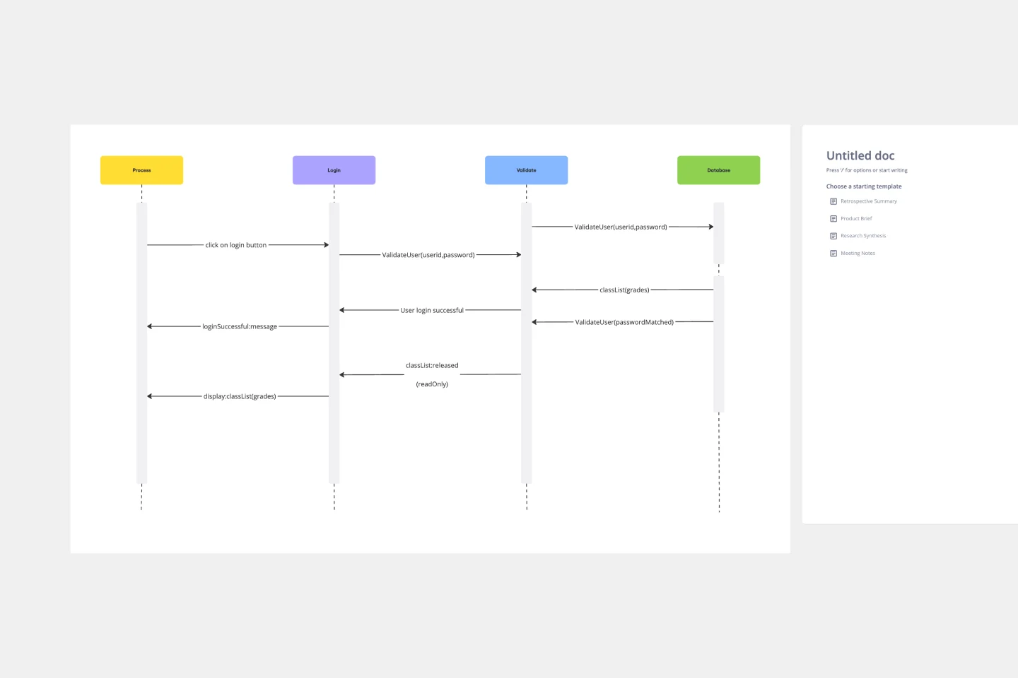
The UML Sequence Login Diagram Template is a valuable tool for visualizing user authentication processes. It breaks down complex login sequences into clear, visual components, facilitating collaborative understanding among team members, regardless of their technical expertise. This shared understanding is crucial for ensuring all stakeholders, from developers to project managers, are on the same page, leading to efficient decision-making and a smoother development process. The template's ability to translate technical details into an accessible format streamlines communication and significantly reduces the likelihood of misinterpretation or oversight, making it an essential asset in any software development project.
Azure Demand Forecasting Template
Works best for:
Software Development, Diagrams
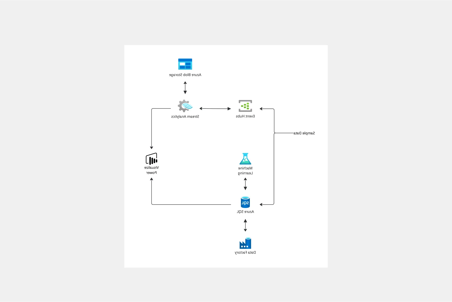
The Azure Demand Forecasting diagram will show the architecture of a demand forecast, making it easier for you to predict data consumption, costs, and forecast results. Azure is Microsoft’s cloud computing platform, designed to provide cloud-based services such as remote storage, database hosting, and centralized account management. Azure also offers new capabilities like AI and the Internet of Things (IoT).
Competitive Analysis Template
Works best for:
Marketing, Decision Making
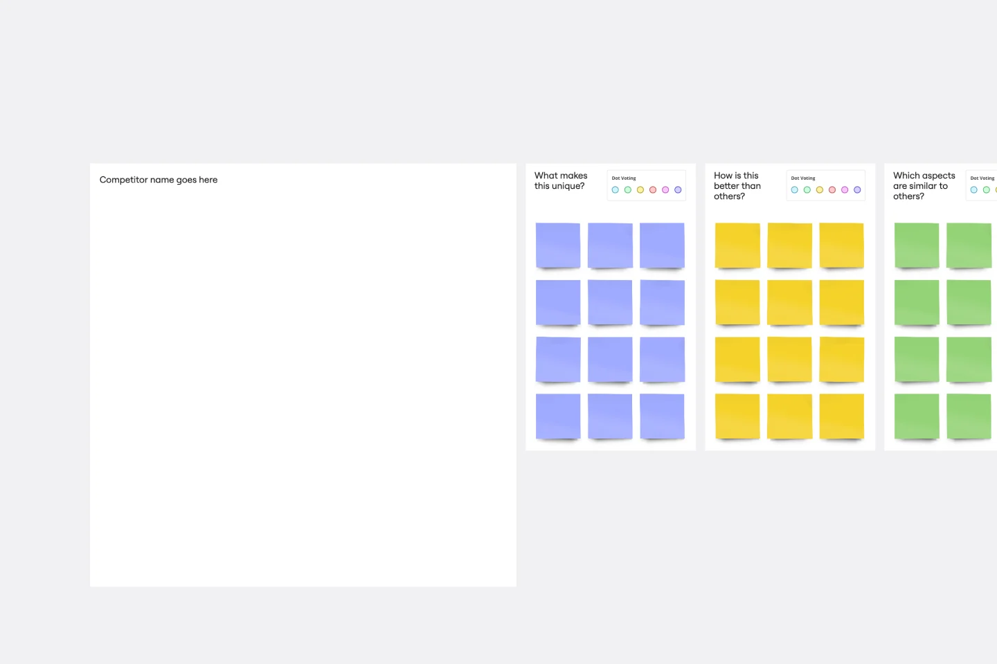
Developing a great product starts with knowing the lay of the land (meaning who you’re up against) and answering a few questions: Who are your competitors? How does your product or service compare? What makes you stand out? A competitive analysis will help find the answers, which can ultimately shape your product, value prop, marketing, and sales strategies. It’s a great exercise when a big business event is about to occur — like a new product release or strategic planning session.
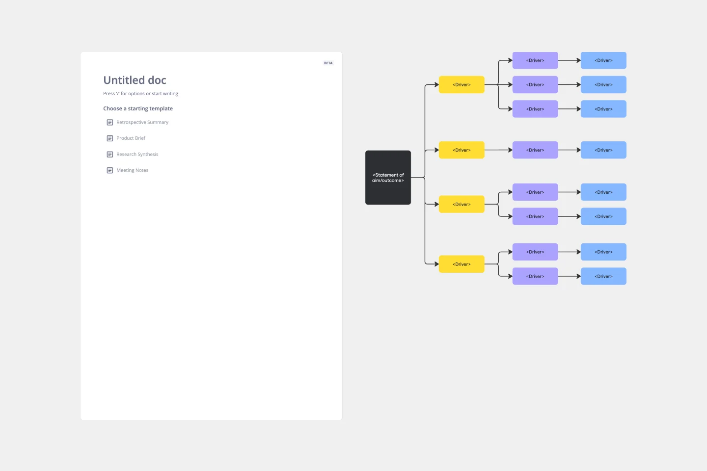
Driver Diagram Template
Works best for:
Diagramming
The driver diagram template is a strategic visual tool that helps teams map out their primary objectives and break them down into actionable components. It presents goals, drivers, and specific change ideas in a coherent and interconnected format, ensuring clarity of objective. By doing so, every team member is aligned towards a common endpoint, fostering unified efforts. The visual nature of the template simplifies complex objectives, making it easier for teams to stay on track and measure their progress effectively.
Chat-Bot
Works best for:
Diagramming
The Chat Bot template is a visual tool for designing and mapping out chatbot interactions and functionalities. It provides a structured framework for visualizing conversation flows, user inputs, and bot responses. This template enables teams to collaborate on designing chatbot experiences that are intuitive and user-friendly, driving engagement and satisfaction. By promoting clarity and alignment, the Chat-Bot template empowers organizations to create effective chatbot solutions that meet user needs and business objectives.
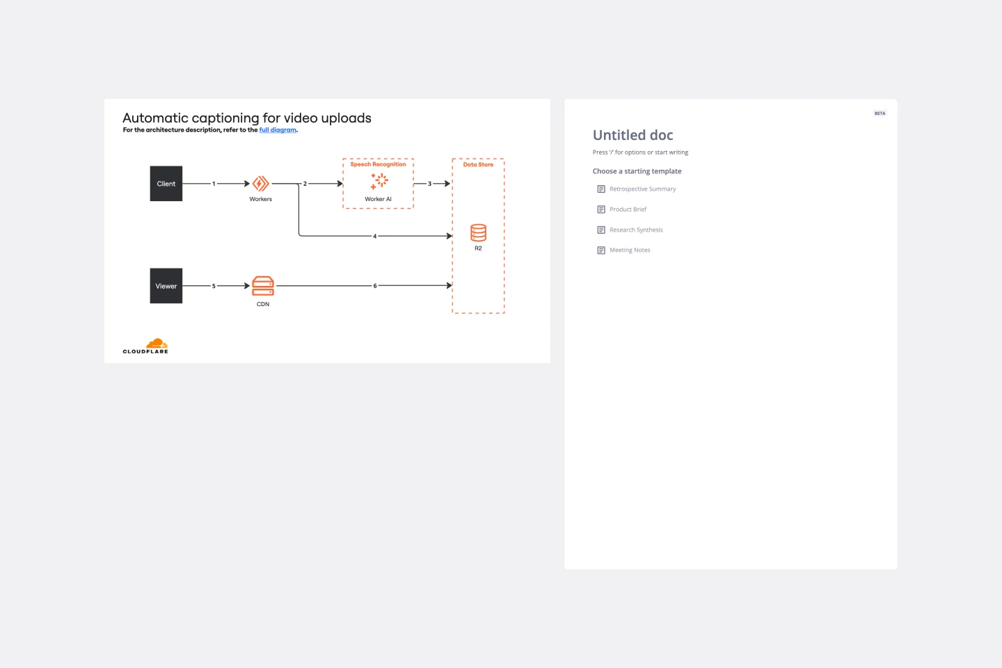
Cloudflare Automatic Captioning for Video Template
The Cloudflare Automatic Captioning for Video Template in Miro is a powerful tool designed to enhance the accessibility and engagement of video content. By leveraging Cloudflare's technology, this template helps outline the captioning process for videos. It not only makes content accessible to a broader audience, including those who are deaf or hard of hearing but also boost viewer engagement by making videos consumable in sound-sensitive environments or by individuals who prefer reading along.