Euler Diagram Template
Map out relationships and connections between different ideas, subjects, and elements.
About the Euler Diagram Template
The Euler Diagram Template helps you understand complex hierarchies and deconstruct arguments, ideas, systems, and overlapping definitions.
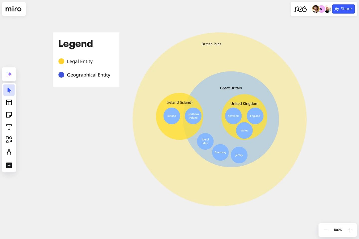
This diagram lets you visualize all the possible connections between a number of groups and make sense of complex relationships. For example, you can use one to show the relationships between viruses, humans, and other organisms.
You can also use Euler diagrams to chart out the relationships between different people in an organization or the structures of computer networks.
In short, Euler diagrams are useful when you want to represent complicated hierarchies or understand how items in a group relate to each other.
Keep reading to learn more about our Euler Diagram Template.
What is an Euler diagram?
Euler diagrams are a visual representation of existing relationships between a number of items (sets).
In mathematics, sets represent collections of objects. These groupings, or “sets,” can be any category: people, buildings, cars, computer networks, or anything else.
Set Theory states that grouping similar elements can often simplify problems, making them easier to work with.
Euler diagrams can also represent a given scenario from different perspectives. For example, they can help you visualize how a particular treatment affects patients from different demographics.
This is useful to understand the impact of certain conditions, simplify a complex concept, or compare different approaches to solving a problem.
You can also use Euler diagrams to deconstruct and visualize the relation between ideas in an argument.
Euler diagrams differ from Venn diagrams in that they illustrate already-existing relationships whereas Venn diagrams are used to represent all possible relationships between a set or group.
Benefits of implementing an Euler diagram
Some of the main benefits of implementing an Euler diagram include:
Clarifies complex relationships: Euler diagrams are useful if you want to plot out the connections between a large number of data points. For example, they can help you understand how different groups and categories interconnect.
Allows you to visualize things from multiple perspectives: Euler diagrams are useful in complex thought experiments. They allow you to shift your perspective and see how things would change if you had different inputs.
Improves your decision-making: Euler diagrams can be useful if you want to make a decision between different courses of action. For example, they allow you to see how different management strategies would affect companies from different sectors.
Helps you better analyze arguments: Euler diagrams allow you to deconstruct an argument. They let you uncover different perspectives and visualize how each part contributes to the whole.
Create your own Euler diagram
With Miro, creating an Euler diagram is pretty straightforward. First, select the Euler Diagram Template. Then, follow these steps:
Step 1. Enter the names of categories or groups that you want to classify
The Euler Diagram Template contains pre-made Euler circles or “cells” that let you enter the names of groups. You can add names to your Euler diagram by simply typing the name of a category in each cell.
For example, you can use the pre-made circles to represent 'People,' 'Bacteria,' and 'Organisms' in your Euler diagram.
Step 2. Assign your relationships
Once you’ve added all the names of different groups in your Euler diagram, assign a relationship to each group and category.
In the given example, 'People' and 'Bacteria' both belong to the same category of 'Organisms.' You can add this relationship in the Euler diagram.
You can also add a negative relationship between 'People' and 'Bacteria.' This means that people are not bacteria.
In Miro, you can change the color of a given category to signify whether it’s positive or negative. You change the color of Euler circles by clicking on the color picker and choosing a new color for the circle.
Step 3. Move the Eulerian circles accordingly
Once you have added the relationships between different groups or circles, move them accordingly.
This step involves moving the corresponding circles to their correct position and orientation. You can move the circles by clicking and dragging them.
You can also delete circles by selecting them and hitting 'Delete.' Or, you can edit them by selecting them and typing in a new name.
If you wish, resize the circles to get an accurate representation of your diagram. For example, if a category has many sub-categories, you can resize the circle so that every category fits in the main circle.
You can also supplement your Euler diagram using Miro's graph maker to create other charts. Miro is also the perfect Venn diagram maker with a range of Venn diagram templates.
A real-world example of an Euler diagram
Let’s say that you want to understand the economic relationship between European countries. You could represent the European Union as one circle. Then, inside this circle, you can represent how different countries relate to each other in terms of trade. You can split this circle into different sections, representing different types of goods that countries trade with each other.
For example, you could have Germany buying Swedish wine and selling plastic goods to Spain. Then you could have France buying Italian liquor but selling cars to Germany.
You can add these relationships to your Euler diagram and then use them to get a better understanding of which countries trade with each other.
What is the difference between a Venn diagram and an Euler diagram?
In short, Venn diagrams are used to represent all possible relationships between a set or group, whereas Euler diagrams illustrate already-existing relationships.
How do you draw an Euler circle?
With our Euler Diagram Template, you get access to pre-made circles that you can drag and drop into your diagram. This way, you can easily create an Euler diagram without drawing your circles manually.
Who made the Euler diagram?
Euler diagrams are named after the Swiss mathematician Leonhard Euler, who first used them to study the Seven Bridges of Königsberg problem.
What are Euler diagram arguments?
Euler diagram arguments are relationships that certain categories have with other groups or categories. With Miro's Euler Diagram Template, you can add these relationships straight into your diagram.
Get started with this template right now.
Flyer Maker Template
Works best for:
Design, Marketing
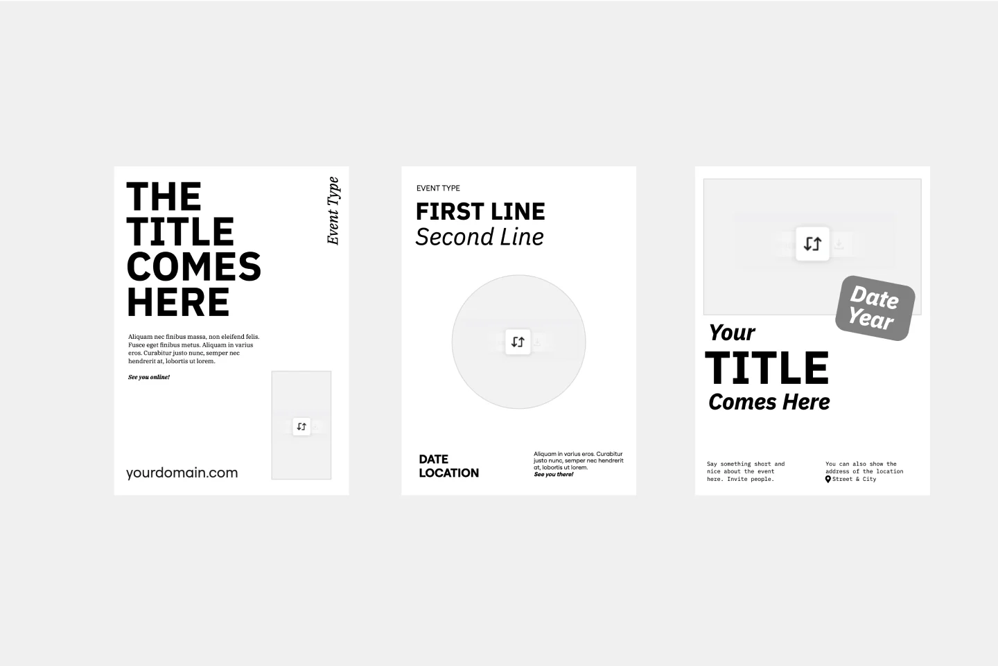
Whether it’s a client party or a nonprofit fundraiser, your event needs one key thing to be a smashing success: people to show up. That’s why promoting it is such an important part of the planning—and creating and sending a flyer is the first step. These single-page files will grab your guests’ attention and give them the key details, such as the time, date, and location (and if it’s a fundraiser, who/what the funds will benefit). This template will let you lay out text and customize a flyer design.
Causal Loop Diagram Template
Works best for:
Diagramming
The Causal Loop Diagram Template offers a structured framework to visualize the intricate interconnections within any system. Its standout benefit is the ability to provide a holistic perspective, ensuring that users don't just see isolated issues but understand the entire web of relationships, ultimately leading to more informed and strategic decision-making.
Spaghetti Diagram Template
Works best for:
Operations, Mapping, Diagrams
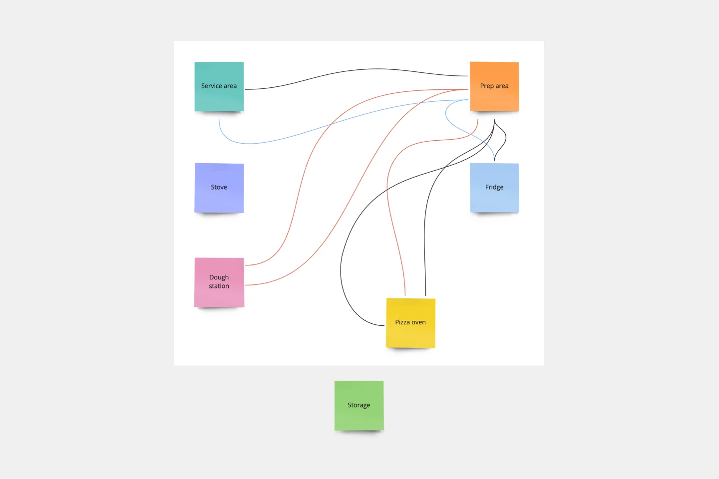
Spaghetti diagrams are valuable for finding connections between assets, services, and products, as well as identifying dependencies in a visual way. Use this template to get an overview of a process and quickly find areas of improvement.
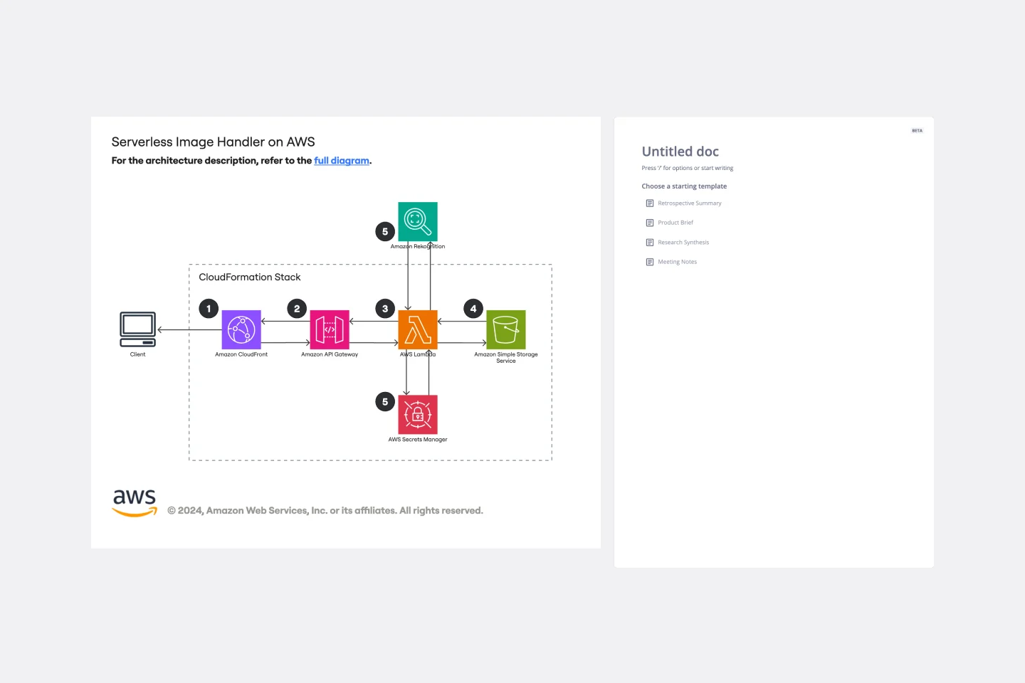
Serverless Image Handler on AWS Template
Works best for:
AWS
The Serverless Image Handler on AWS template is designed to facilitate the management and transformation of images in cloud-based projects without the need for server infrastructure management. It is particularly useful for applications and projects that require dynamic image management, offering benefits like efficiency, scalability, and seamless integration with AWS services. By incorporating this template into Miro boards or projects, teams can streamline their workflows, especially when dealing with digital assets or dynamic content, ensuring that their image-handling needs are met efficiently as they scale.
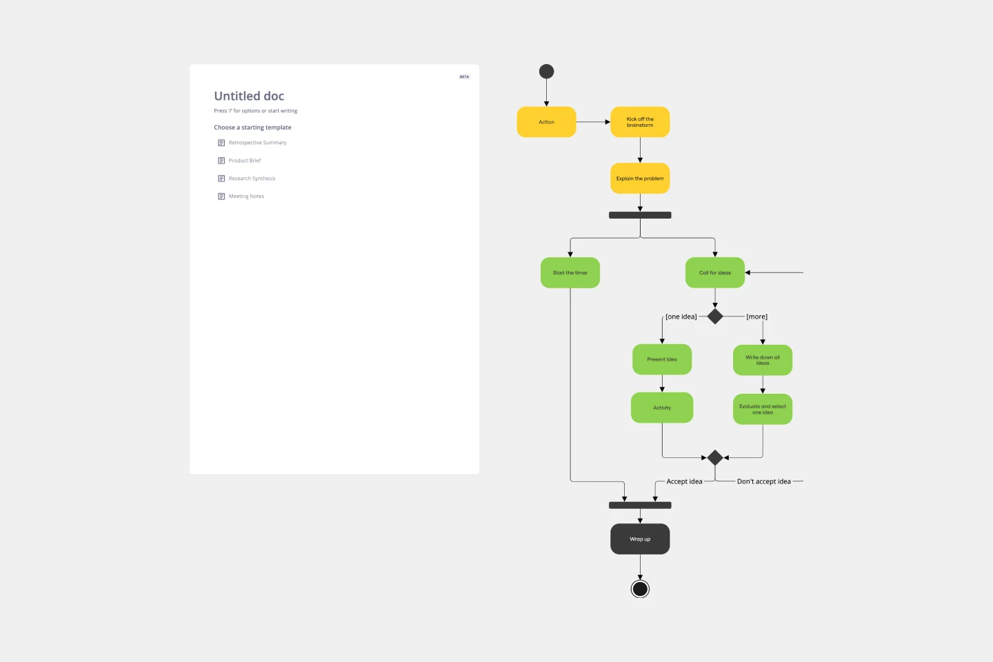
UML Activity Diagram Template
Works best for:
Diagrams
Use our Activity Diagram template to break down activities into smaller decisions and subprocesses. Improve and optimize systems and processes in I.T., business management, and more.
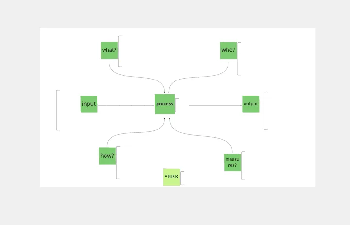
Turtle Diagram for BA
Works best for:
Diagramming
The Turtle Diagram for BA template offers a visual framework for defining and auditing business processes according to ISO 9001 standards. It provides elements for documenting process inputs, outputs, activities, and controls. This template enables organizations to ensure compliance, identify process improvements, and enhance quality management practices. By promoting systematic process documentation and auditability, the Turtle Diagram for BA empowers organizations to achieve and maintain ISO 9001 certification, demonstrating commitment to quality and continuous improvement.