Dotted Line Org Chart Template
Navigate the complex web of your organization's relationships with the dotted line org chart template.
About the Dotted Line Org Chart Template
The dotted line org chart template helps you navigate the complex web of organizational relationships. This template is designed to streamline hierarchical structures and visually represent reporting lines, responsibilities, and connections within a team or company. Whether mapping out a startup's structure or improving communication in an established corporation, the dotted line org chart template is your go-to solution for promoting clarity and collaboration.
Understanding the dotted line org chart
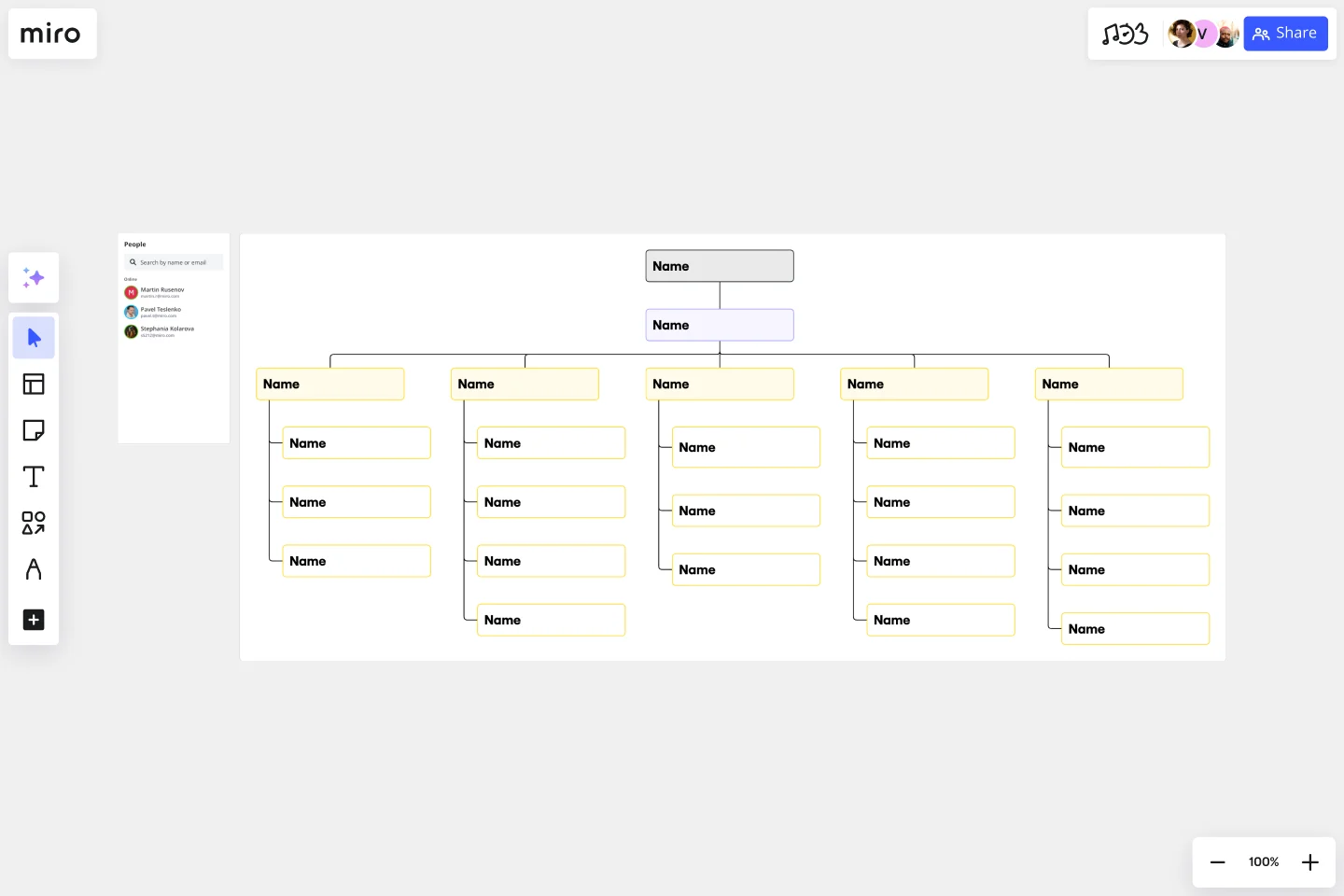
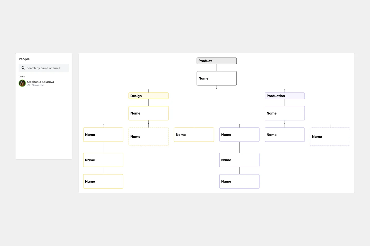
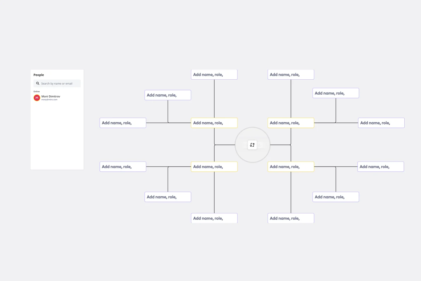
The template helps you illustrate reporting structures, showcasing the interconnections between organizational roles. The template includes key elements:
Roles and positions: Clearly define each role within the organization, illustrating the hierarchical order and reporting lines.
Dotted lines: These dotted lines represent secondary or indirect reporting relationships, commonly known as dotted line reporting. They emphasize connections that may be outside the traditional hierarchical structure.
Connectors: Use connectors to link roles and positions, visually representing the reporting relationships and dependencies within the organization.
Labels and descriptions: Enhance clarity by adding labels and descriptions to each position, providing context for the responsibilities associated with each role.
How to use the dotted line org chart template
Drag and drop shapes: Add positions and roles by dragging and dropping shapes onto the board. Arrange them according to your organizational structure.
Connect with dotted lines: Create dotted lines using connectors to represent indirect reporting relationships. Customize the length and style of the lines to suit your preferences.
Automated diagramming: Expand your chart effortlessly. Add more shapes and connectors with just a few clicks, ensuring your org chart remains dynamic and up-to-date.
Add context: Enhance your org chart with additional context by adding artifacts such as documents, images, or notes directly onto the Miro board. Provide a comprehensive view of each role's responsibilities and contributions.
Why use a dotted line org chart template?
Clarity and transparency: Provide a clear visual representation of reporting relationships, minimizing confusion and fostering transparency.
Enhanced communication: Facilitate better communication by showcasing direct and dotted line reporting, ensuring everyone understands the interconnectedness within the organization.
Effortless updates: Easily adapt to changes in the organizational structure by using Miro's automated diagramming features to update the org chart with minimal effort.
Collaborative decision-making: Encourage collaborative decision-making by offering a comprehensive overview of roles and responsibilities, enabling teams to work more cohesively.
Strategic planning: Use the dotted line org chart template to inform strategic planning, helping leadership identify areas for improvement and optimize team dynamics.
Miro is the perfect organizational chart maker to help visualize and understand your organization's hierarchical structure and reporting lines between roles. If you're interested in learning more about organizational charts, read our in-depth guide.
Can I customize the appearance of the org chart?
Miro allows you to customize the appearance of the org chart by adjusting shapes, colors, and styles to align with your organization's branding or preferences. Use the menu context bar by selecting the shape you want to edit.
Can I add more details to each role on the org chart?
You can enhance each role by adding labels, and descriptions or even attaching documents directly to the org chart for a more comprehensive view.
Get started with this template right now.
Business Organizational Chart Template
Works best for:
Leadership, Org Charts, Operations
Establishing hierarchy in a business can empower employees—to know their roles and responsibilities, team members, potential cross-functional collaborators, and who to turn to with a specific need. That’s just what a Business Organizational Chart does. And this template makes it simple to build a BOC for your company. The first step is to determine the high-level organizational structure of your company. Then it's easy to create a visual representation of how different employees are interconnected.
Circular Org Chart Template
Works best for:
Organizational Chart
The Circular Org Chart Template is an innovative solution that helps represent and visualize complex organizational structures with ease. The key advantage of this template is its ability to present complex hierarchies in a visually appealing and easy-to-understand format. By adopting a circular arrangement, the template provides a comprehensive and holistic view of the organization, making it effortless for teams to comprehend reporting relationships at a glance. The visual clarity offered by this template fosters efficient communication and decision-making, offering a seamless experience for teams to understand their organizational structure. The template's intuitive design and emphasis on visual representation significantly enhance transparency, promoting a deeper understanding of organizational roles and relationships.
Building Inclusive Organisations
Works best for:
Org Charts, Operations, Mapping
This board is made after running 4 months of research on Diversity, Equity, Inclusion & Belonging at fintech-unicorn Pleo, where we learnt what it takes to build a truly inclusive organisation.
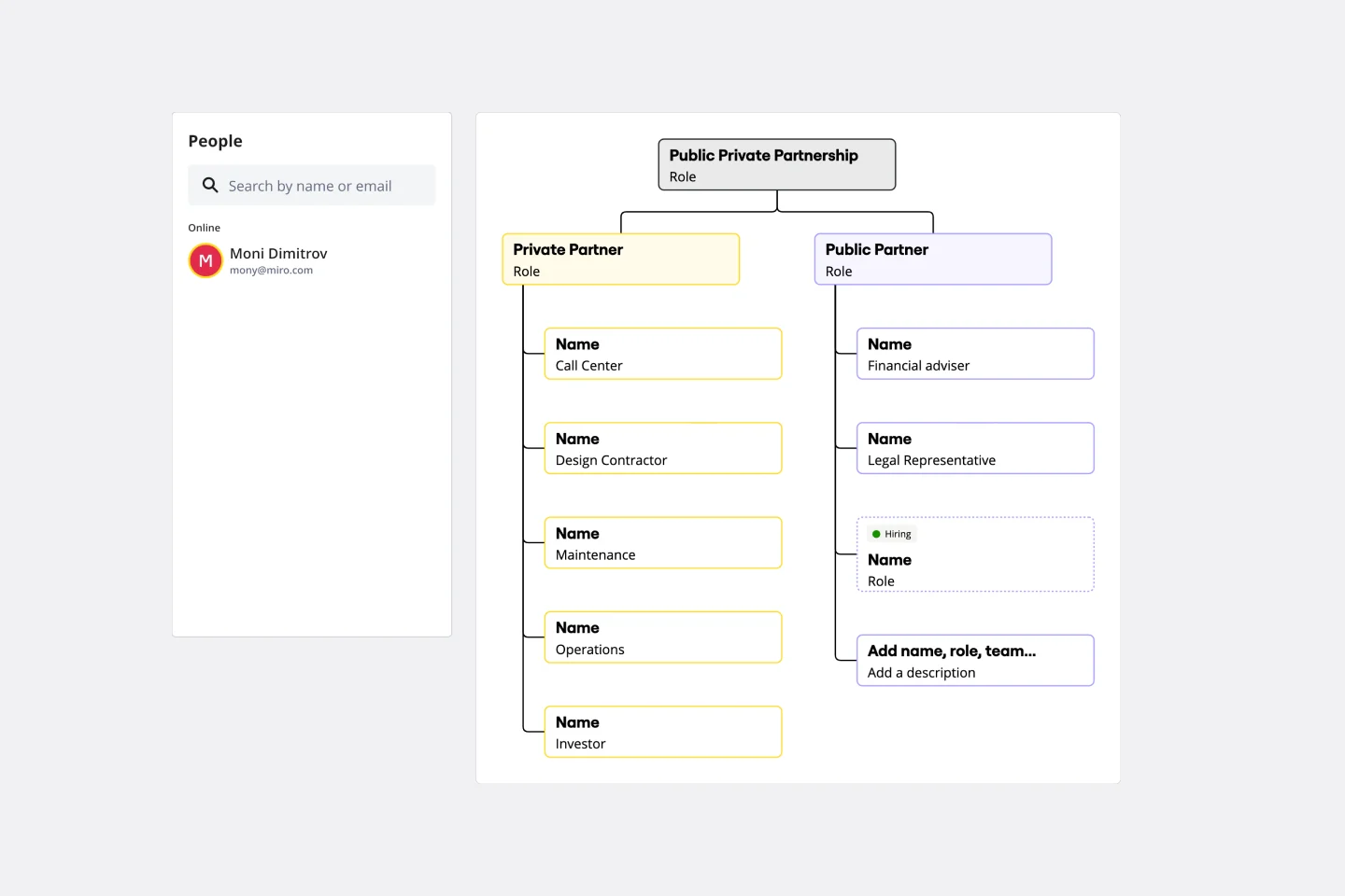
Partnership Org Chart Template
Works best for:
Org Charts, Organizational Design
The Partnership Org Chart Template is an interactive tool that visually represents the intricate network of relationships between business partners. It provides a clear and structured layout that helps users grasp how different entities align and interact within a collaborative ecosystem. One of its standout benefits is the clarity it offers. In the often complex world of inter-organizational relationships, having a straightforward, visual representation of partnerships eliminates ambiguities and ensures all stakeholders are on the same page. This fosters more effective collaboration and strategic planning, making it an essential business tool.
Team Charter by Daniela Felser
Works best for:
Org Chart
The Team Charter template helps teams establish shared goals, values, and norms. By defining team purpose, roles, and operating principles, this template aligns team members and guides collaboration. With sections for setting objectives and outlining team processes, this template promotes transparency and cohesion, enabling teams to work efficiently towards common objectives.
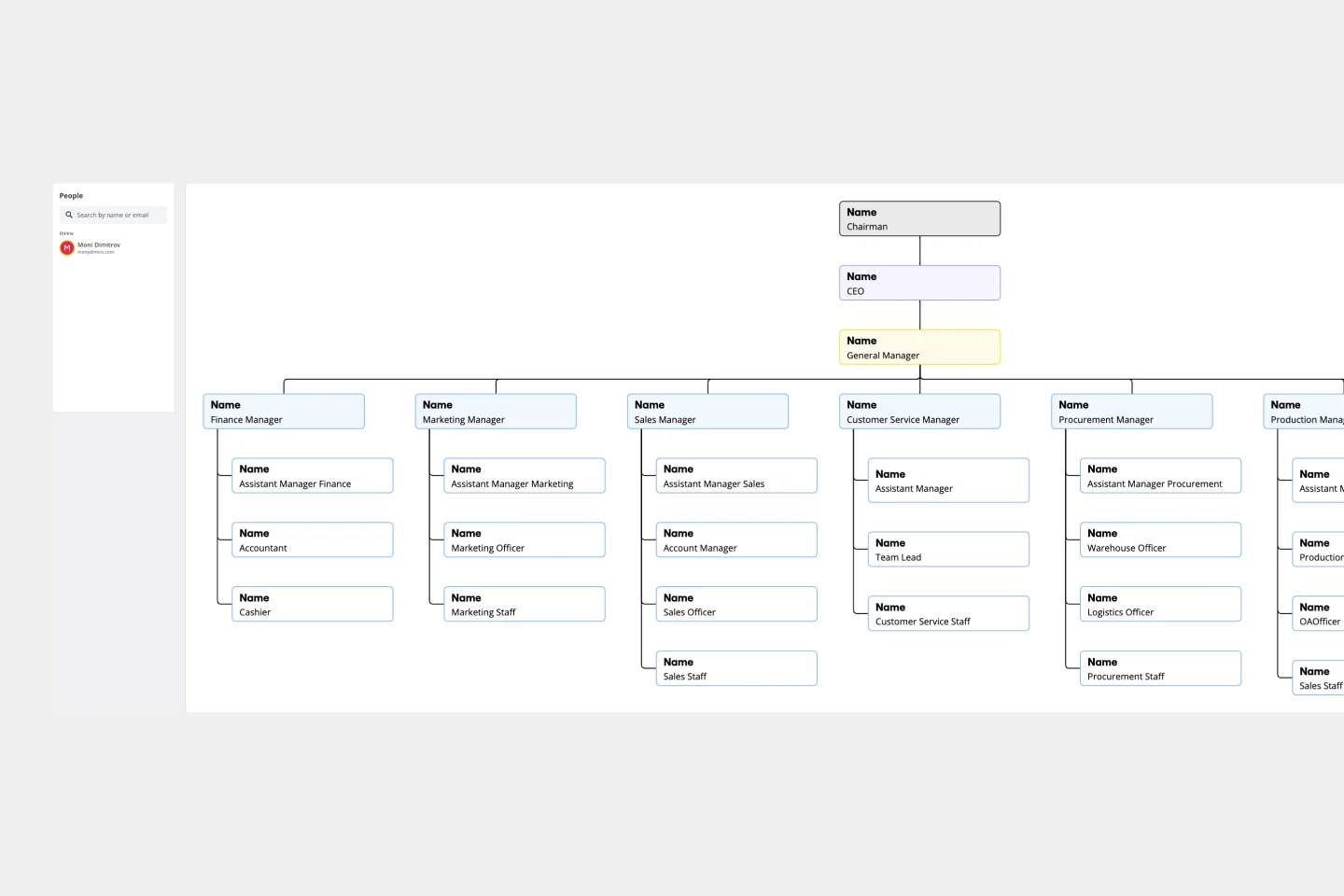
Vertical Organizational Chart
Works best for:
Organizational Charts, Organizational Design
The Vertical Organizational Chart Template is an efficient way to illustrate the hierarchy of an entity in a top-down format. This tool helps represent roles and relationships in a clear manner, starting from the topmost authority and branching downwards. It allows for a better understanding of the flow of responsibilities and communication channels within the organization. One of its most significant advantages is promoting clear communication. Depicting the organization's structure helps avoid misunderstandings and ensures everyone is on the same page regarding the chain of command.