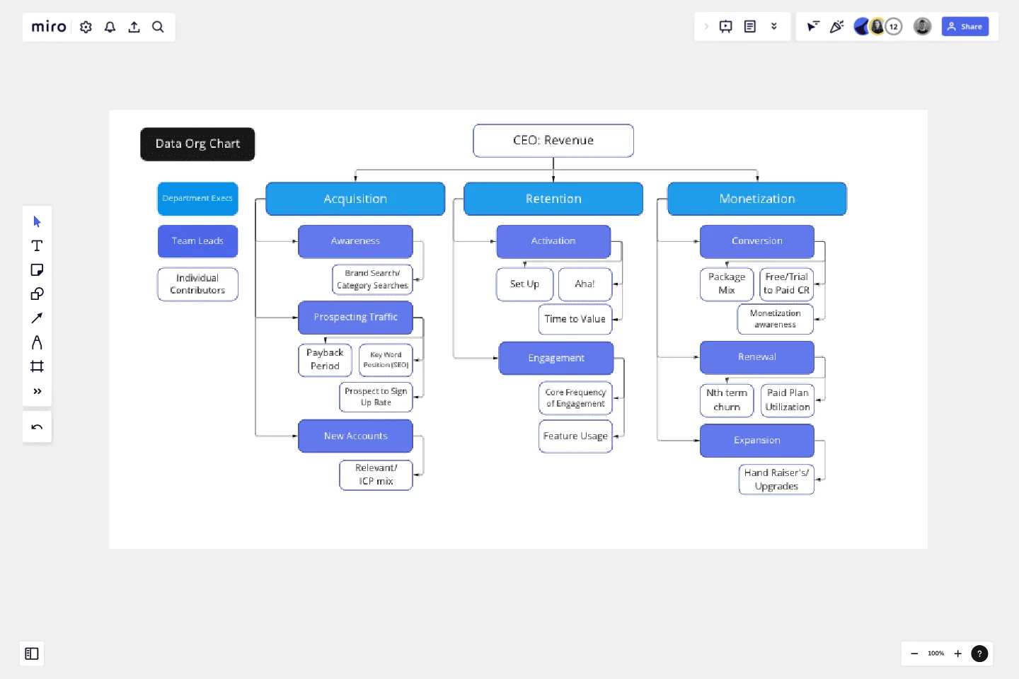
Data Org Chart
Succeed with your data-driven culture by creating a data 'org chart'.
This template will be most useful for Analysts, PMs, Marketers and Department Leaders who want to achieve data accountability with tight connection between initiatives and business outcomes. Having clear roles and responsibilities is always the key!
How to read this chart:
Individual Contributors — where 90% of the work is happening and how all of the growth initiatives are measured. Individual Contributor KPIs are constantly iterated (~ on quarterly basis) in the search for the best causality and predictive power. These KPIs are used for setting initiative goals and are often reflected in the individual team member quarterly goals.
Team Leads — responsible for the evaluation and selection of ICs. Team Lead metrics are often set as 'company metrics' on the leadership level and have a clear source of truth for self-serve consumption. Owned by PMs or Marketers.
Common pitfalls: The biggest mistake is to not set ownership of the team metrics. It can result in vanity IC selection or floating definitions ultimately leading to distrust and data-culture failure.
Department execs — data levers, not KPIs, and are the closest predictors to revenue. Department exec metrics are owned by the head of growth, product, marketing, etc.
Common pitfalls: Unfortunately, often misassigned. For example, in a product-led monetization model, only sales own revenue.
CEO — fearless leader, but not a doer.
Common pitfalls: Looking at revenue as your metric is being at least 3 months late to the party of your ability to impact it.
Use this template to:
Map out all of the metrics your cross-functional team is tracking and visualize the relationships (or lack thereof) to ‘Team Leads’ and ‘Department Execs’ metrics.
Highlight lack of ownership of certain metrics.
Understand over/under focus on certain growth levers, if no individual contributors are being tracked under ‘Team Lead’ or ‘Department Execs’ metrics.
Understand correlation vs. causation by reviewing data org chart on a quarterly basis.
Become hyper focused on metrics that matter the most.
This template was created by Elena Verna.
Get started with this template right now.
Funding Tracker Template
Works best for:
Kanban Boards, Operations
For many organizations, especially non-profits, funding is their lifeblood—and meeting fundraising goals is a crucial part of carrying out their mission. A funding tracker gives them a powerful, easy-to-use tool for measuring their progress and staying on course. And beyond helping you visualize milestones, this template will give you an effective way to inspire the public to donate, and help you keep track of those donors. It’s especially useful when you have multiple donations coming from a variety of sources.
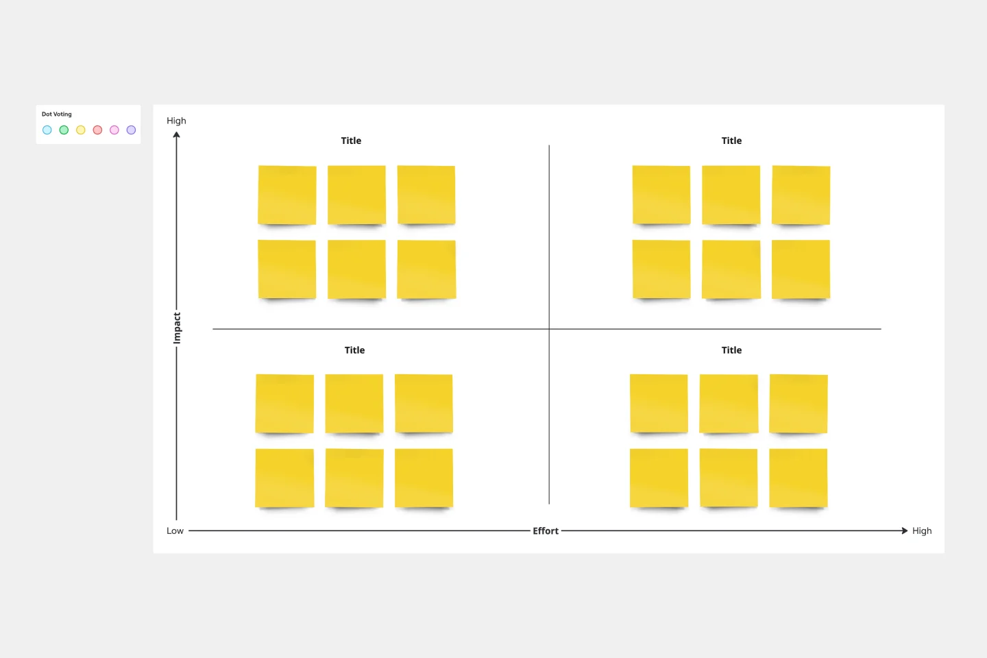
Action Priority Matrix Template
Works best for:
Mapping
You and your teammates probably have more ideas than resources, which can make it difficult to prioritize tasks. Use an Action Priority Matrix to help choose the order in which you will work on your tasks, allowing you to save time and money and avoid getting bogged down in unnecessary work. An Action Priority Matrix is a simple diagram that allows you to score tasks based on their impact and the effort needed to complete them. You use your scores to plot each task in one of four quadrants: quick wins, major projects, fill-ins, and thankless tasks.
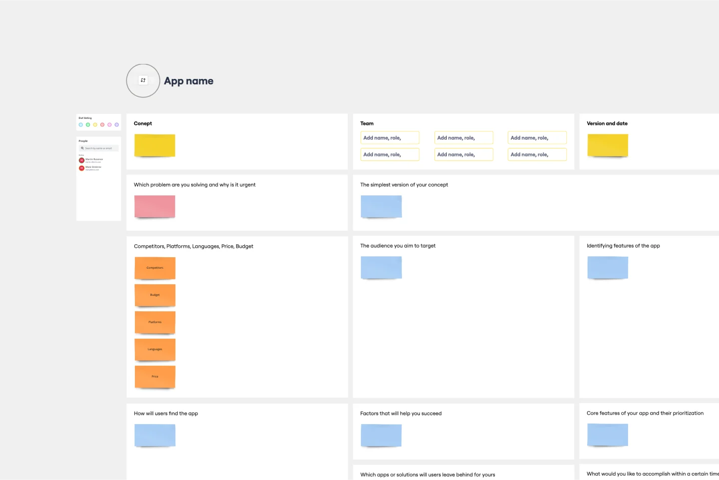
App Development Canvas Template
Works best for:
Market Research, Product Management, User Experience
Ever noticed that building a successful app requires lots of players and moving parts? If you’re a project manager, you definitely have. Lucky for you, an app development canvas will let you own and optimize the entire process. It features 18 boxes, each one focusing on a key aspect of app development, giving you a big-picture view. That way you can fine-tune processes and get ahead of potential problems along the way—resulting in a smoother path and a better, tighter product.

5W1H Template
Works best for:
Strategy & Planning
The 5W1H Template is a strategic framework that clarifies complex situations or projects into six foundational questions: What, Who, Where, When, How, and Why. This methodological approach ensures a comprehensive understanding, encouraging teams to dissect and explore every aspect of a given challenge or project.
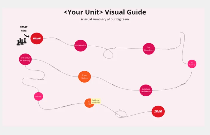
Org Unit Visual Guide
Works best for:
Org Charts, Operations, Mapping
Org Unit Visual Guide template offers a visual reference for understanding organizational units and their relationships. By mapping out departments, teams, and reporting lines, this template enhances clarity and transparency. With customizable features for adding annotations and descriptions, this template facilitates communication and alignment across organizational units.
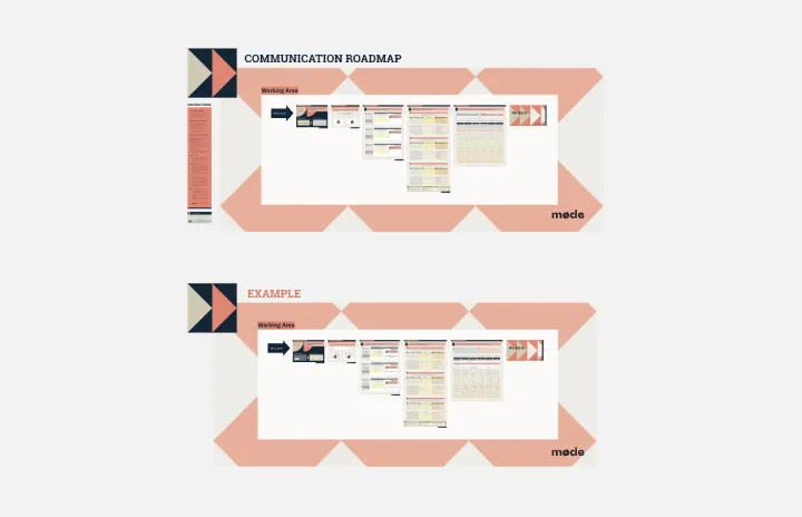
Communication Roadmap
Works best for:
Roadmap, Mapping, Planning
The Communication Roadmap template enables teams to plan and execute effective communication strategies. By outlining key messages, channels, and stakeholders, teams can ensure consistent and targeted communication throughout a project lifecycle. This template fosters alignment and transparency, enabling teams to engage stakeholders effectively and mitigate risks associated with miscommunication.