AWS Architecture Diagram Template
The AWS Architecture Diagram is a visual representation of the AWS framework, and it also translates the best practices when using Amazon Web Services architecture.
Available on Enterprise, Business, Education plans.
About the AWS Architecture Diagram
The AWS Architecture Diagram is a visual representation of the Amazon Web Services architecture. AWS is a cloud web service designed for you to store data at a minimum cost. Government agencies, companies, and organizations often need to store their data securely without overloading the platforms, and with the AWS Architecture, they can ensure their cloud solutions are working smoothly.
Keep reading to learn more about the AWS Architecture Diagram Template.
What is an AWS Architecture Diagram Template
The AWS Architecture Diagram Template, like any other network diagram, visually shows the necessary steps of the architecture within AWS. The AWS Architecture Diagram has unique icons, symbols, and arrows that you can use for planning, designing, or auditing an architecture before or after deployment.
What are the AWS Diagram system elements?
The AWS architecture system key elements include:
Shapes: includes service, resource, or general resource icons from AWS.
Connectors: includes arrows that describe a flow of information or connect different parts of the diagram. They have a predetermined color.
Layout and grouping: the groups show the connection between multiple services or resources.
Styling and semantics: the colors mean the types of AWS functions and they are predetermined. When selecting an icon from the library, the right color will automatically be used.
When to use AWS Architecture Diagram Template
You can use the AWS Architecture Diagram Template to communicate and collaborate with your team. With the AWS Architecture diagram, you will be able to:
Identify single points of error
Design for fault-tolerance
Design for cost optimization
Build security into your design
Troubleshoot faster
Conduct security reviews
Prove and maintain compliance
Onboard new employees
IT professionals often use the AWS Architecture Diagram to easily see and evaluate the cloud infrastructure that supports the business or organization. There are specific logos and icons from Amazon Web Services that also are easy to identify and search, so you and your team can easily manage the system architecture. The main categories of the AWS icons are: compute icons, stage icons, database icons, and networking and content delivery icons.
How to use this template
To create your AWS Architecture Diagram in Miro, follow the steps:
Lay out the structure: select the groups to use.
Open AWS Icon Set to add Architecture service and resource icons.
Add other steps: Does your diagram include external users or devices? Use resources to add depth or context to your diagram.
Connect the steps with arrows: use the arrows to connect the steps and describe the workflow.
If you are interested in creating other network diagrams, Miro is the perfect network diagram tool with several available shape packs and templates to suit your needs.
How do I make an AWS architecture diagram?
Making an AWS architecture diagram in Miro is easy. You can use our AWS Architecture Diagram Template to and customize it as you see fit. Here’s how you can easily customize it: 1. Click on the “Diagramming” icon in the creation toolbar. 2. Click on the “More shapes” button. 3. Check the “AWS” to add it to your library. 4. Drag and drop additional resources, services, and containers as you see fit. 5. Use the Connection Line to connect related entities.
How is AWS architected?
The AWS Architecture Diagram framework has five pillars that describe the key concepts, design principles, and best practices for designing and running workloads in the Amazon cloud. See below these 5 AWS framework principles: Operational Excellence: runs and monitors systems to deliver business value Security: protects information and systems, keeps confidentiality and integrity of data Reliability: ensures the workload performs and recovers from failures quickly Performance Efficiency: uses IT and computing resources efficiently Cost optimization: avoids unnecessary costs, controls the money
Get started with this template right now. Available on Enterprise, Business, Education plans.
Affinity Diagram by UserPeek
Works best for:
Diagramming
The Affinity Diagram template is a visual tool for organizing and categorizing ideas, data, or issues into related groups. It provides a structured framework for conducting group brainstorming and affinity grouping activities. This template enables teams to synthesize information, identify patterns, and generate insights collaboratively. By promoting creativity and collaboration, the Affinity Diagram empowers teams to organize and prioritize information effectively, driving decision-making and problem-solving processes efficiently.
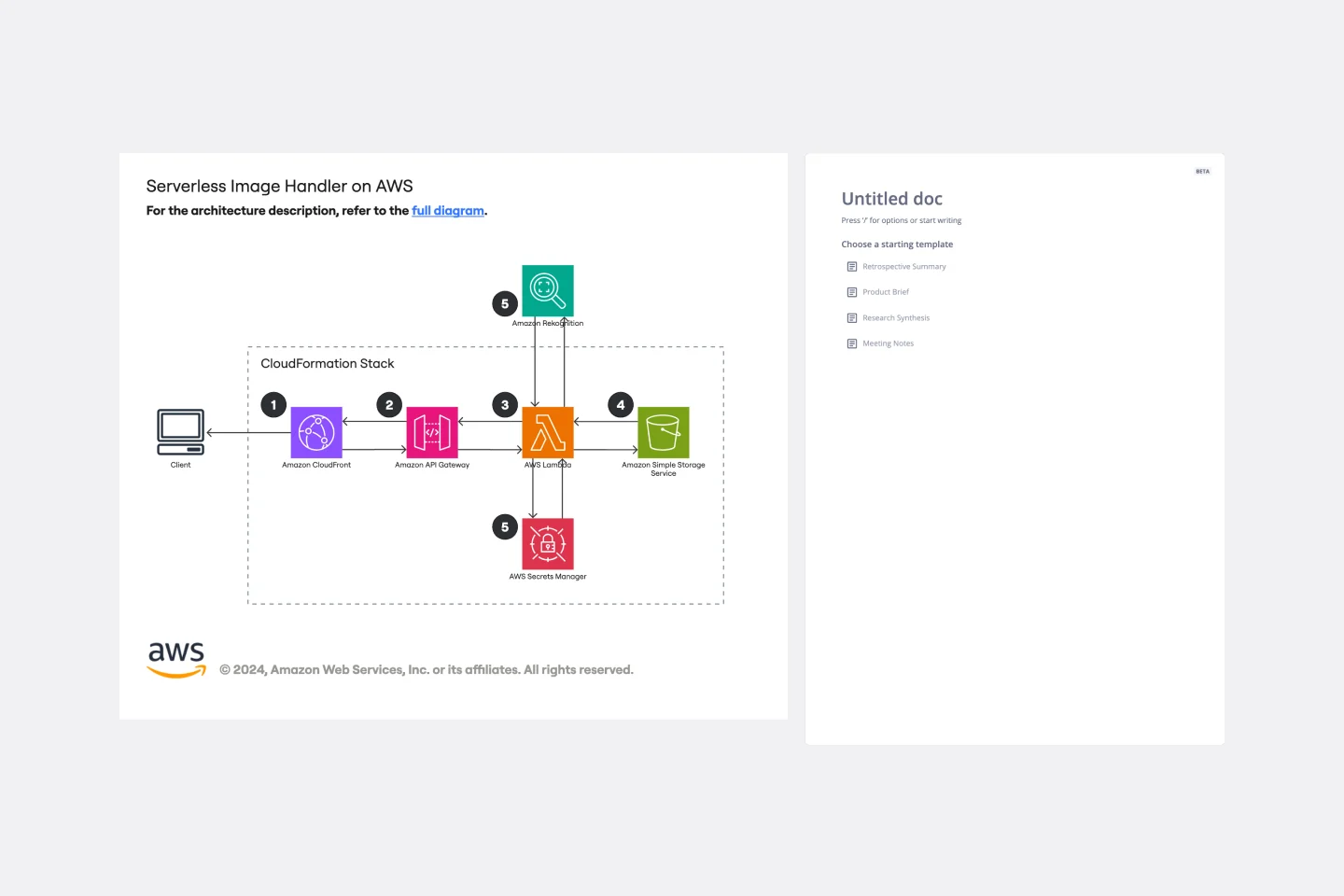
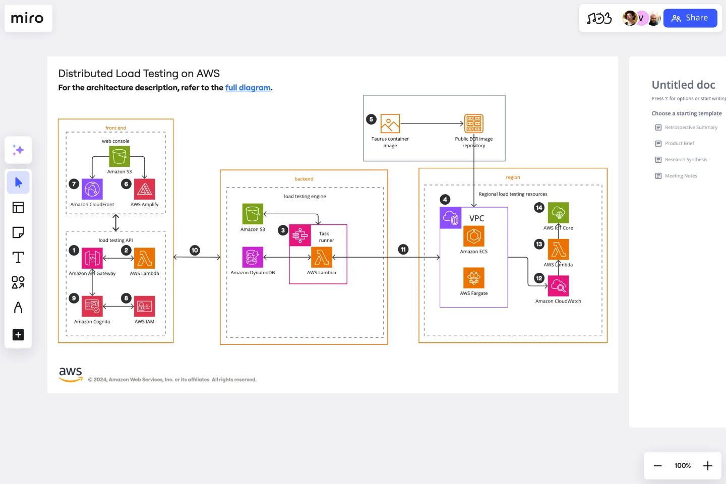
Serverless Image Handler on AWS Template
Works best for:
AWS
The Serverless Image Handler on AWS template is designed to facilitate the management and transformation of images in cloud-based projects without the need for server infrastructure management. It is particularly useful for applications and projects that require dynamic image management, offering benefits like efficiency, scalability, and seamless integration with AWS services. By incorporating this template into Miro boards or projects, teams can streamline their workflows, especially when dealing with digital assets or dynamic content, ensuring that their image-handling needs are met efficiently as they scale.
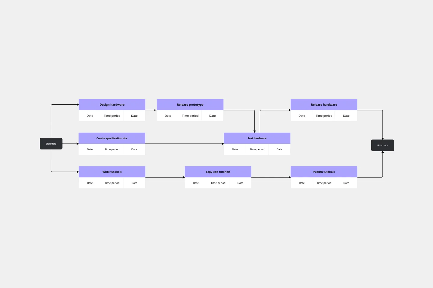
PERT Chart Template
Works best for:
Mapping, Project Planning
A Program Evaluation and Review Technique (PERT) diagram is used to plan projects efficiently. They help you set a clear timeline, plan out tasks and dependencies, and determine a critical path.
Technology Roadmap Template
Works best for:
Agile Methodology, Roadmaps, Agile Workflows
A technology roadmap helps teams document the rationale of when, why, how, and what tech-related solutions can help the company move forward. Also known as IT roadmaps, technology roadmaps show teams what technology is available to them, focusing on to-be-scheduled improvements. They allow you to identify gaps or overlap between phased-out tech tools, as well as software or programs soon to be installed. From a practical point of view, the roadmap should also outline what kinds of tools are best to spend money on, and the most effective way to introduce new systems and processes.
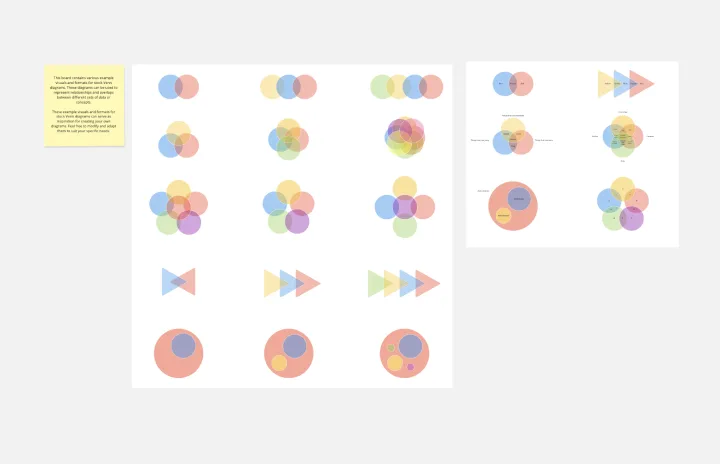
Venn Diagrams by Dave Westgarth
Works best for:
Venn Diagram
Visualize relationships and intersections clearly with the Collection Venn Diagram template. This tool is perfect for comparing multiple sets of data, identifying commonalities, and showcasing unique elements. Use it in presentations, research, and data analysis to make complex information more digestible. Ideal for educators, researchers, and analysts seeking to present data insights effectively.
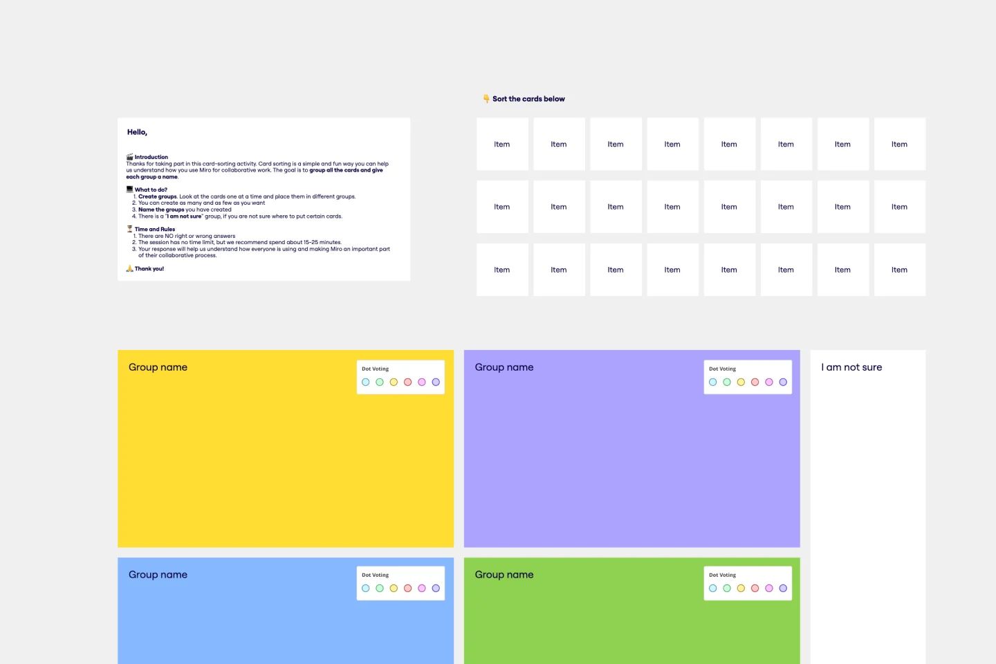
Card Sorting Template
Works best for:
Desk Research, UX Design, Brainstorming
Card sorting is a brainstorming technique typically used by design teams but applicable to any brainstorm or team. The method is designed to facilitate more efficient and creative brainstorms. In a card sorting exercise, you and your team create groups out of content, objects, or ideas. You begin by labeling a deck of cards with information related to the topic of the brainstorm. Working as a group or individuals, you then sort the cards in a way that makes sense to you, then label each group with a short description. Card sorting allows you to form unexpected but meaningful connections between ideas.