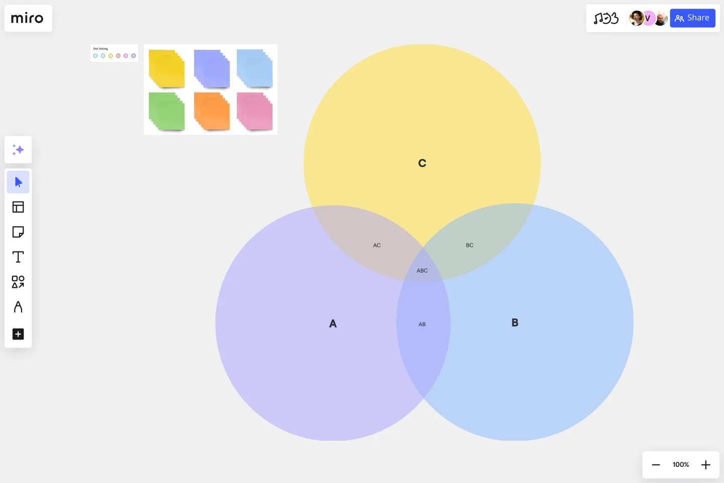
3-Circle Venn Diagram
Visually understand the relationships, similarities, and differences between three different groups using our fully customizable 3-circle Venn diagram template.
About the 3-Circle Venn Diagram Template
Miro’s 3-circle Venn diagram template is a visual tool for providing a clear and effective way to showcase relationships between datasets. By overlapping two or more circles, Venn diagrams are great for visualizing the differences and similarities between multiple datasets.
It’s therefore no surprise that they’re useful for assessing probability in statistics, mathematics, and engineering. Because they can help break down complex ideas into visually appealing and digestible ways, Venn diagrams are especially useful for brainstorming and problem-solving.
Using the 3-circle Venn diagram template saves you time from having to build one from scratch. We’ll walk you through how to make the most of it.
How to use the 3-circle Venn diagram template
To get started, click on the blue “use template” button to open the 3-circle Venn diagram template in Miro. When you’re ready, follow these steps:
1. Add data to each circle
As its name implies, the 3-circle Venn diagram template comes with three circles ready for you to fill in. Identify what groups you want to compare in your Venn diagram and assign them to each circle: A, B, and C. In each circle, list the items that belong to that group.
For example, let’s say you’re comparing the qualities of an apple, a pear, and an orange. You could use circle A to list an apple’s qualities, circle B to list a pear’s qualities, and circle C to list an orange’s.
2. Identify the differences
Let’s say you’re comparing apples, pears, and oranges based on their color. You could write “red” in circle A, “green” in circle B, and “orange” in circle C. Since each fruit has a unique color, you’ll notice that none of them are part of overlapping circles. These are your differences. Double-click the text boxes in each circle to replace the pre-written text with your own.
3. Identify the similarities
Identify what all three fruits have in common and make sure that you’ve placed those qualities in the overlapping section of the circle. For example, you might write “contains seeds” as a similarity. Double-click on the text box in the overlapping section to edit the pre-written text.
4. Customize the template
Once you’ve added all the information you need to compare your three objects or concepts, it’s time to customize the look and feel. It’s easy to change up shapes, sizes, and font types in the 3-circle Venn diagram template — whether you want to align your diagram with brand colors, present your information more clearly, or simply make it more visually appealing.
Want to try creating your Venn diagram from scratch? Explore our Venn diagram tool to learn more.
Benefits of using Miro’s 3-circle Venn diagram template
Miro makes it easy to create Venn diagrams online with your team and discuss them in real time or asynchronously. It only takes seconds to add the 3-circle Venn diagram template, saving you time from having to create one from scratch while allowing you to dive straight into the customization process. Easily edit text, drag and drop your own images, and tag your teammates in comments.
With an infinite canvas, you can also add as many sticky notes, shapes, and images as you need to add context to your Venn diagram. On top of that, Miro integrates with over 130 apps, including project management tools like Jira and Trello and entire suites like Microsoft 365 and Google Workspace. That means you get to use the 3-circle Venn diagram template alongside other tools you already love.
Is Miro’s 3-circle Venn diagram template free?
Yes, Miro’s 3-circle Venn diagram template is free and customizable. Simply click on “use template” to open the template in Miro and start filling it in, editing the look and feel, and sharing it with teammates when you’re ready.
When should I use Miro’s 3-circle Venn diagram template?
One of Venn diagrams' most well-known use cases is determining probability — which is especially common in fields like data analytics, engineering, and other scientific fields. Speaking of science, they’re helpful for visual problem-solving complex algorithms in the world of software and computer science. That said, Venn diagrams are also popular in the arts, such as studying the similarities and differences between various languages and language groups. In other words, you can use Venn diagrams anytime you have to compare two or more groups.
What are the key components of a Venn diagram?
There are six key components: sets, union, intersection, symmetric difference, complement, and relative complement. Sets refer to the data you’re comparing, such as numbers, ideas, or even objects. Union refers to everything that we’re considering in the Venn diagram — also known as the universal set. The intersection refers to what the datasets have in common — where the circles overlap. The symmetric difference includes everything except the intersection. The complement refers to everything that doesn’t belong to a particular set, while the relative complement refers to everything that’s in one set but not another.
Get started with this template right now.
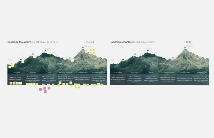
Roadmap Mountain
Works best for:
Roadmap, Planning, Mapping
The Roadmap Mountain template provides a metaphorical framework for planning and visualizing project objectives and milestones. By depicting the journey towards achieving goals as a mountain ascent, teams can inspire motivation and focus. This template encourages collaborative goal-setting and fosters a sense of accomplishment as teams progress towards their summit. With clear milestones in sight, teams can stay motivated and track their progress effectively.
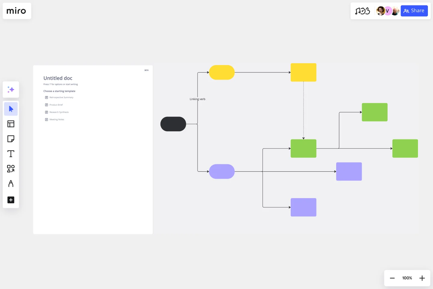
Concept Map Template
Works best for:
Education, Mapping, Brainstorming
Use the concept map template to create new ideas, structure your thoughts, and bring your innovations to life. It allows you to explore connections between concepts and let your creativity flow in an organized format. As a result, you’re able to visualize how to bring your new ideas to reality and how various concepts relate to each other.
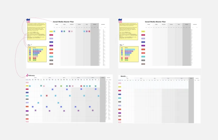
Social Media Strategy Planning
Works best for:
Roadmap, Planning, Mapping
The Social Media Strategy Planning template provides a structured approach for developing and implementing social media strategies. By defining objectives, target audiences, and content plans, teams can maximize the impact of their social media efforts. This template fosters collaboration and alignment across teams, ensuring that social media initiatives are integrated with broader marketing goals and contribute to overall business objectives.
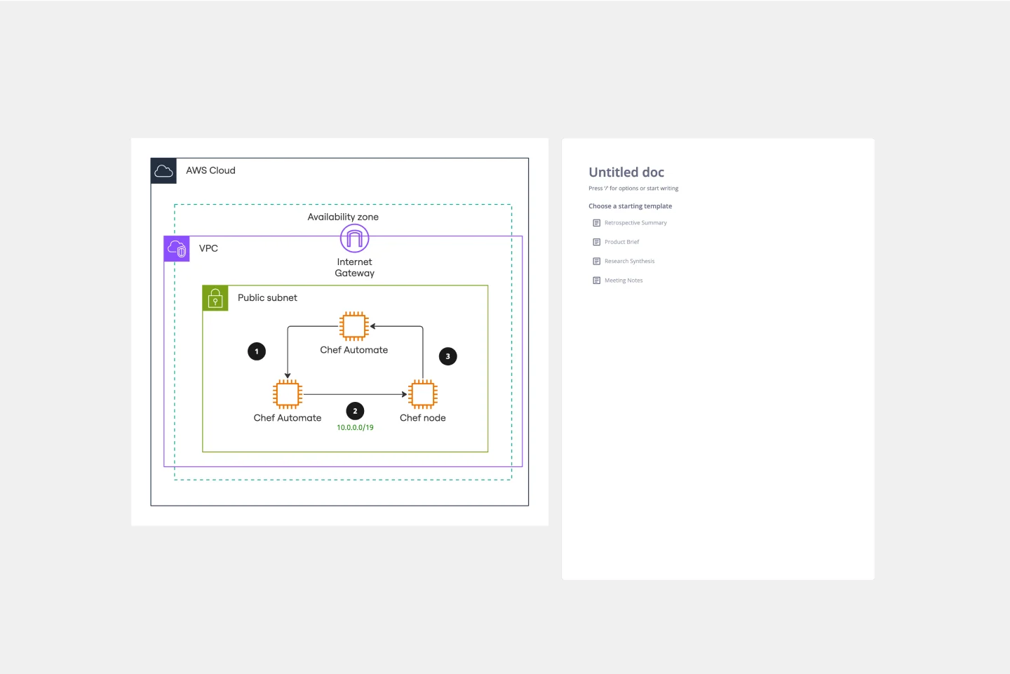
AWS Chef Automate Architecture Template
Works best for:
Software Development, Diagrams
The AWS Chef Automate Architecture Template is a visual representation of the AWS Chef framework. Track your cloud solutions easily, and automate operational tasks at scale like never before.
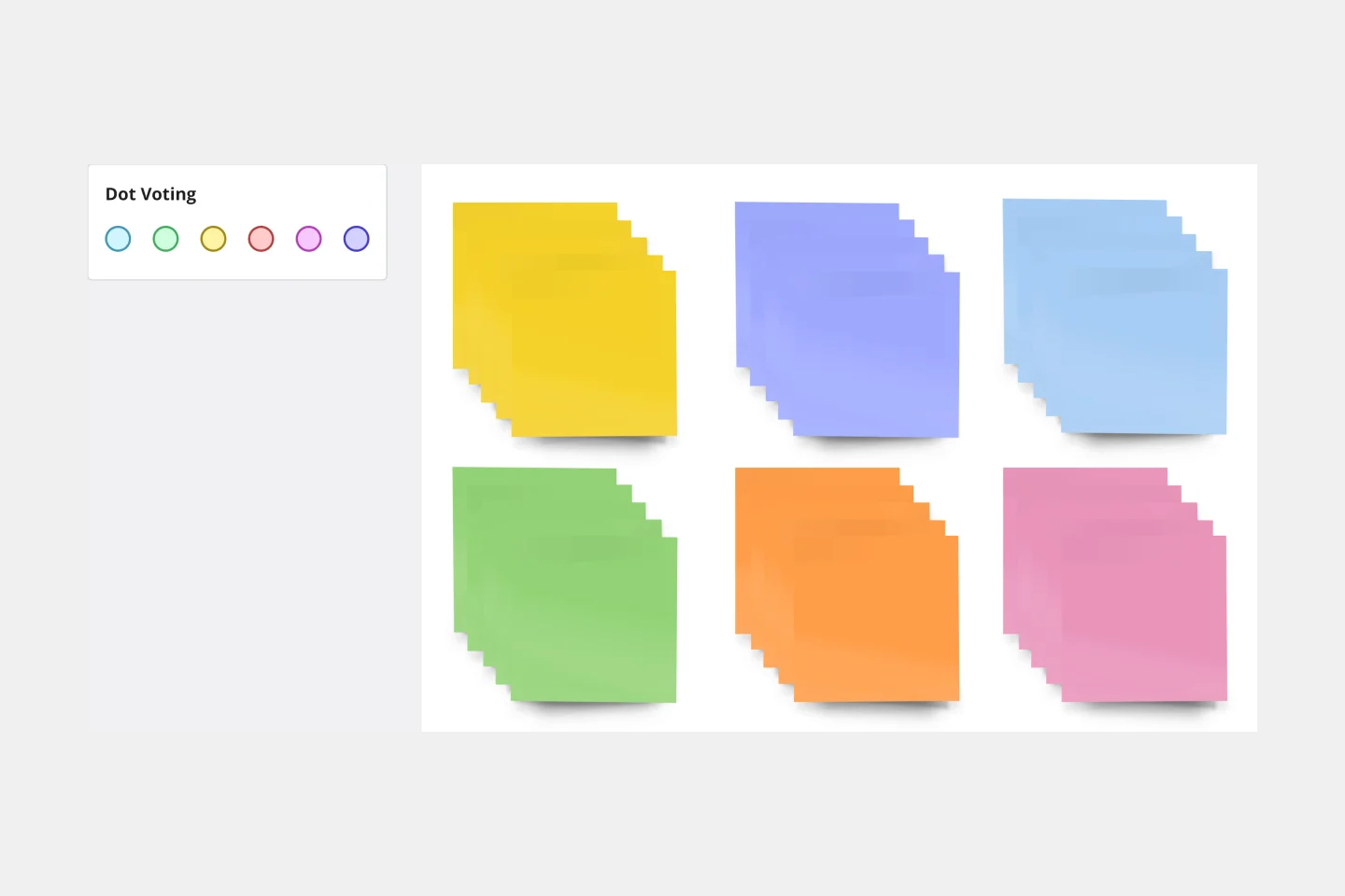
Sticky Note Packs Template
Works best for:
Brainstorming, Meetings, Workshops
Use Miro’s Stickies Packs template to facilitate your brainstorming and group sessions. Use them to organize your ideas, collaborate as a team, and encourage participation from everyone involved.
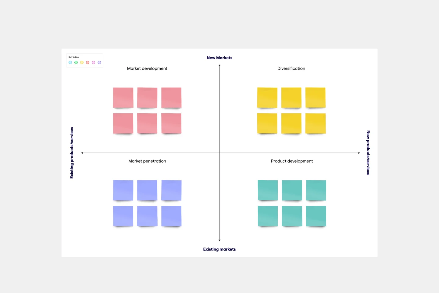
Ansoff Matrix Template
Works best for:
Leadership, Operations, Strategic Planning
Keep growing. Keep scaling. Keep finding those new opportunities in new markets—and creative new ways to reach customers there. Sound like your approach? Then this template might be a great fit. An Ansoff Matrix (aka, a product or market expansion grid) is broken into four potential growth strategies: Market Penetration, Market Development, Product Development, and Diversification. When you go through each section with your team, you’ll get a clear view of your options going forward and the potential risks and rewards of each.